Python Openpyxl 生成图表

Python Openpyxl 生成图表

小田测测看
发布于 2026-06-17 17:59:34
发布于 2026-06-17 17:59:34
有时候想要丰富下测试报告,使用表格显然不是最佳的方式,记录下使用openpyxl在Excel 中插入饼图、柱形图、折线图和雷达图等
通过 pip 进行安装:
pip install openpyxlExcel中的三大对象
WorkBook:工作簿对象
Sheet:表单对象
Cell:表格对象
数据驱动测试之Excel基础讲解
对Excel的操作
wb = openpyxl.Workbook() # 新建工作簿
wb = openpyxl.load_workbook('demo.xlsx') # 打开工作簿
wb.save('demo.xlsx') # 保存文件

wb.create_sheet('test_case') #创建sheet
sh = wb['Sheet1'] # 读取sheet

cell= sh.cell(row = 1,column = 1) # 读取第一行第一列数据

value = 'result':sh.cell(row = 1,column = 4,value = 'result') # 写入第一行、第四列的数据
sh.max_row、sh.max_column # 获取最大行总数、最大列总数
实战
先生成一个基础的数据
import openpyxl
from openpyxl.chart import PieChart, BarChart, LineChart, RadarChart
from openpyxl.chart import Reference, Series
from openpyxl.chart.label import DataLabelList


wb = openpyxl.Workbook()
ws_data = wb.active
ws_data.title = "缺陷数据"

# --- 模拟下测试缺陷数据 ---

headers = [
    "模块名称", "严重级别", "发现日期", "是否已修复"
]
data = [
    ["用户登录", "严重", "2025-10-26", "是"],
    ["商品列表", "一般", "2025-10-27", "是"],
    ["购物车", "致命", "2025-10-26", "否"],
    ["用户登录", "轻微", "2025-10-28", "是"],
    ["支付流程", "严重", "2025-10-27", "否"],
    ["订单管理", "一般", "2025-10-29", "是"],
    ["商品详情", "轻微", "2025-10-28", "是"],
    ["用户登录", "一般", "2025-10-29", "是"],
    ["购物车", "严重", "2025-10-30", "否"],
    ["支付流程", "致命", "2025-10-30", "否"],
    ["用户中心", "一般", "2025-10-27", "是"],
    ["商品搜索", "轻微", "2025-10-28", "是"],
    ["首页轮播", "一般", "2025-10-29", "是"],
    ["购物车", "轻微", "2025-10-26", "是"],
    ["支付流程", "严重", "2025-10-28", "否"],
]

ws_data.append(headers)
for row in data:
    ws_data.append(row)
生成饼图
ws_pie = wb.create_sheet("按模块缺陷分布(饼图)")

module_counts = {}
for row in data:
    module = row[0]
    module_counts[module] = module_counts.get(module, 0) + 1


labels = list(module_counts.keys())
values = list(module_counts.values())


ws_pie.append(["模块", "缺陷数量"])
for label, value inzip(labels, values):
    ws_pie.append([label, value])


pie_chart = PieChart()
pie_chart.title = "Sprint 25.10 各模块缺陷分布"

data_ref = Reference(ws_pie, min_col=2, min_row=2, max_row=1 + len(values))
category_ref = Reference(ws_pie, min_col=1, min_row=2, max_row=1 + len(values))

series = Series(data_ref, title="缺陷数")
pie_chart.append(series)
pie_chart.set_categories(category_ref)


pie_chart.dataLabels = DataLabelList()
pie_chart.dataLabels.showVal = True
pie_chart.dataLabels.showCatName = True
pie_chart.dataLabels.showPercent = True

ws_pie.add_chart(pie_chart, "D2")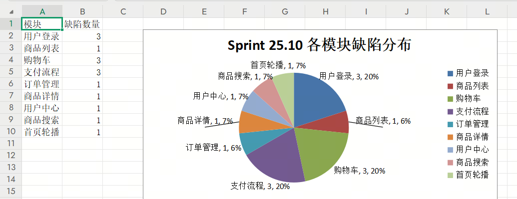
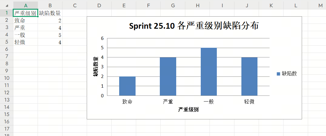
柱形图
ws_bar = wb.create_sheet("按严重级别缺陷分布(柱形图)")

severity_order = ["致命", "严重", "一般", "轻微"]
severity_counts = {level: 0for level in severity_order}
for row in data:
    severity = row[1]
    if severity in severity_counts:
        severity_counts[severity] += 1

sorted_severities = list(severity_counts.keys())
sorted_values = [severity_counts[level] for level in sorted_severities]

ws_bar.append(["严重级别", "缺陷数量"])
for severity, count inzip(sorted_severities, sorted_values):
    ws_bar.append([severity, count])

bar_chart = BarChart()
bar_chart.title = "Sprint 25.10 各严重级别缺陷分布"
bar_chart.x_axis.title = "严重级别"
bar_chart.y_axis.title = "缺陷数量"

data_ref = Reference(ws_bar, min_col=2, min_row=2, max_row=1 + len(sorted_values))
category_ref = Reference(ws_bar, min_col=1, min_row=2, max_row=1 + len(sorted_values))

series = Series(data_ref, title="缺陷数")
bar_chart.append(series)
bar_chart.set_categories(category_ref)

ws_bar.add_chart(bar_chart, "D2")
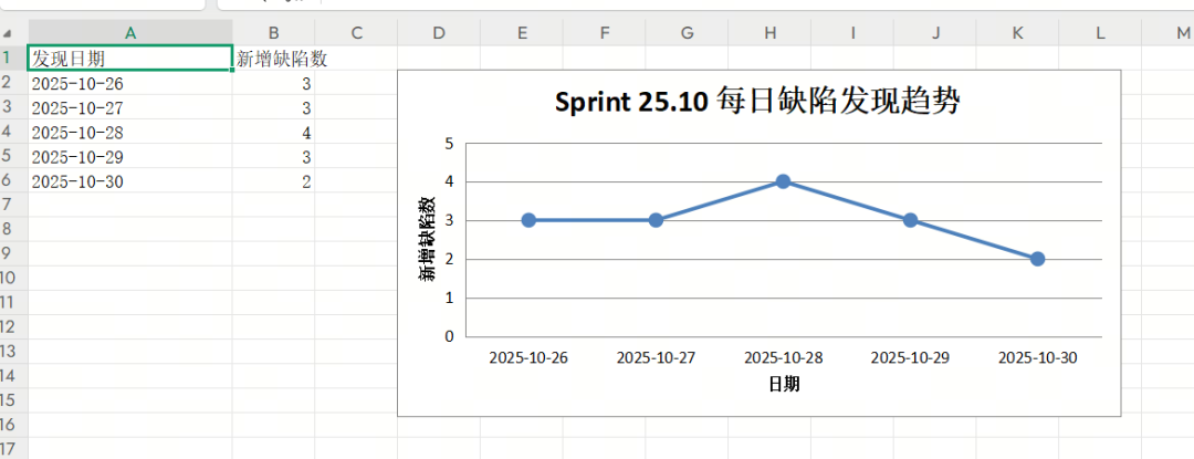
折线图
ws_line = wb.create_sheet("按日期缺陷趋势(折线图)")

date_counts = {}
for row in data:
    date = row[2]
    date_counts[date] = date_counts.get(date, 0) + 1

# 按日期排序
sorted_dates = sorted(date_counts.keys())
sorted_date_values = [date_counts[date] for date in sorted_dates]

ws_line.append(["发现日期", "新增缺陷数"])
for date, count inzip(sorted_dates, sorted_date_values):
    ws_line.append([date, count])

# 创建折线图
line_chart = LineChart()
line_chart.title = "Sprint 25.10 每日缺陷发现趋势"
line_chart.x_axis.title = "日期"
line_chart.y_axis.title = "新增缺陷数"
line_chart.legend = None# 只有一条线,不需要图例

data_ref = Reference(ws_line, min_col=2, min_row=2, max_row=1 + len(sorted_date_values))
category_ref = Reference(ws_line, min_col=1, min_row=2, max_row=1 + len(sorted_date_values))

series = Series(data_ref, title="新增缺陷数")
series.marker.symbol = "circle"# 显示数据点
series.marker.size = 8
line_chart.append(series)
line_chart.set_categories(category_ref)

ws_line.add_chart(line_chart, "D2")

# --- 图表4: 各模块缺陷修复率对比 (雷达图) ---
ws_radar = wb.create_sheet("各模块缺陷修复率(雷达图)")

# 统计各模块的总缺陷数和已修复数
module_stats = {}
for row in data:
    module = row[0]
    is_fixed = row[3] == "是"

    if module notin module_stats:
        module_stats[module] = {"total": 0, "fixed": 0}

    module_stats[module]["total"] += 1
    if is_fixed:
        module_stats[module]["fixed"] += 1

# 计算修复率
modules = list(module_stats.keys())
fix_rates = []
for module in modules:
    stats = module_stats[module]
    rate = (stats["fixed"] / stats["total"]) * 100if stats["total"] > 0else0
    fix_rates.append(round(rate, 1))

ws_radar.append(["模块", "修复率(%)"])
for module, rate inzip(modules, fix_rates):
    ws_radar.append([module, rate])
雷达图
radar_chart = RadarChart()
radar_chart.title = "Sprint 25.10 各模块缺陷修复率对比"
radar_chart.y_axis.title = "修复率 (%)"


data_ref = Reference(ws_radar, min_col=2, min_row=2, max_row=1 + len(fix_rates))
category_ref = Reference(ws_radar, min_col=1, min_row=2, max_row=1 + len(fix_rates))

series = Series(data_ref, title="修复率(%)")
radar_chart.append(series)
radar_chart.set_categories(category_ref)

ws_radar.add_chart(radar_chart, "D2")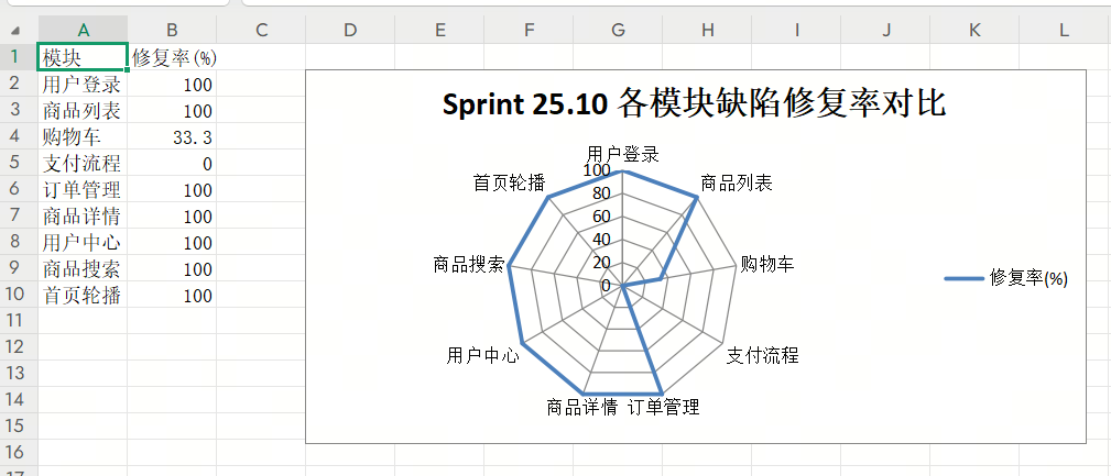
完整代码如下:
import openpyxl
from openpyxl.chart import PieChart, BarChart, LineChart, RadarChart
from openpyxl.chart import Reference, Series
from openpyxl.chart.label import DataLabelList


wb = openpyxl.Workbook()
ws_data = wb.active
ws_data.title = "缺陷数据"

# --- 模拟下测试缺陷数据 ---

headers = [
    "模块名称", "严重级别", "发现日期", "是否已修复"
]
data = [
    ["用户登录", "严重", "2025-10-26", "是"],
    ["商品列表", "一般", "2025-10-27", "是"],
    ["购物车", "致命", "2025-10-26", "否"],
    ["用户登录", "轻微", "2025-10-28", "是"],
    ["支付流程", "严重", "2025-10-27", "否"],
    ["订单管理", "一般", "2025-10-29", "是"],
    ["商品详情", "轻微", "2025-10-28", "是"],
    ["用户登录", "一般", "2025-10-29", "是"],
    ["购物车", "严重", "2025-10-30", "否"],
    ["支付流程", "致命", "2025-10-30", "否"],
    ["用户中心", "一般", "2025-10-27", "是"],
    ["商品搜索", "轻微", "2025-10-28", "是"],
    ["首页轮播", "一般", "2025-10-29", "是"],
    ["购物车", "轻微", "2025-10-26", "是"],
    ["支付流程", "严重", "2025-10-28", "否"],
]

ws_data.append(headers)
for row in data:
    ws_data.append(row)

# --- 3. 数据处理与图表生成 ---

ws_pie = wb.create_sheet("按模块缺陷分布(饼图)")

module_counts = {}
for row in data:
    module = row[0]
    module_counts[module] = module_counts.get(module, 0) + 1


labels = list(module_counts.keys())
values = list(module_counts.values())


ws_pie.append(["模块", "缺陷数量"])
for label, value inzip(labels, values):
    ws_pie.append([label, value])


pie_chart = PieChart()
pie_chart.title = "Sprint 25.10 各模块缺陷分布"

data_ref = Reference(ws_pie, min_col=2, min_row=2, max_row=1 + len(values))
category_ref = Reference(ws_pie, min_col=1, min_row=2, max_row=1 + len(values))

series = Series(data_ref, title="缺陷数")
pie_chart.append(series)
pie_chart.set_categories(category_ref)


pie_chart.dataLabels = DataLabelList()
pie_chart.dataLabels.showVal = True
pie_chart.dataLabels.showCatName = True
pie_chart.dataLabels.showPercent = True


ws_pie.add_chart(pie_chart, "D2")

# --- 图表2: 按严重级别分布的缺陷数量 (柱形图) ---
ws_bar = wb.create_sheet("按严重级别缺陷分布(柱形图)")

severity_order = ["致命", "严重", "一般", "轻微"]
severity_counts = {level: 0for level in severity_order}
for row in data:
    severity = row[1]
    if severity in severity_counts:
        severity_counts[severity] += 1


sorted_severities = list(severity_counts.keys())
sorted_values = [severity_counts[level] for level in sorted_severities]

ws_bar.append(["严重级别", "缺陷数量"])
for severity, count inzip(sorted_severities, sorted_values):
    ws_bar.append([severity, count])

bar_chart = BarChart()
bar_chart.title = "Sprint 25.10 各严重级别缺陷分布"
bar_chart.x_axis.title = "严重级别"
bar_chart.y_axis.title = "缺陷数量"

data_ref = Reference(ws_bar, min_col=2, min_row=2, max_row=1 + len(sorted_values))
category_ref = Reference(ws_bar, min_col=1, min_row=2, max_row=1 + len(sorted_values))

series = Series(data_ref, title="缺陷数")
bar_chart.append(series)
bar_chart.set_categories(category_ref)

ws_bar.add_chart(bar_chart, "D2")

# --- 图表3: 按日期发现的缺陷趋势 (折线图) ---
ws_line = wb.create_sheet("按日期缺陷趋势(折线图)")

date_counts = {}
for row in data:
    date = row[2]
    date_counts[date] = date_counts.get(date, 0) + 1


sorted_dates = sorted(date_counts.keys())
sorted_date_values = [date_counts[date] for date in sorted_dates]

ws_line.append(["发现日期", "新增缺陷数"])
for date, count inzip(sorted_dates, sorted_date_values):
    ws_line.append([date, count])


line_chart = LineChart()
line_chart.title = "Sprint 25.10 每日缺陷发现趋势"
line_chart.x_axis.title = "日期"
line_chart.y_axis.title = "新增缺陷数"
line_chart.legend = None# 只有一条线,不需要图例

data_ref = Reference(ws_line, min_col=2, min_row=2, max_row=1 + len(sorted_date_values))
category_ref = Reference(ws_line, min_col=1, min_row=2, max_row=1 + len(sorted_date_values))

series = Series(data_ref, title="新增缺陷数")
series.marker.symbol = "circle"# 显示数据点
series.marker.size = 8
line_chart.append(series)
line_chart.set_categories(category_ref)

ws_line.add_chart(line_chart, "D2")

# --- 图表4: 各模块缺陷修复率对比 (雷达图) ---
ws_radar = wb.create_sheet("各模块缺陷修复率(雷达图)")

module_stats = {}
for row in data:
    module = row[0]
    is_fixed = row[3] == "是"

    if module notin module_stats:
        module_stats[module] = {"total": 0, "fixed": 0}

    module_stats[module]["total"] += 1
    if is_fixed:
        module_stats[module]["fixed"] += 1


modules = list(module_stats.keys())
fix_rates = []
for module in modules:
    stats = module_stats[module]
    rate = (stats["fixed"] / stats["total"]) * 100if stats["total"] > 0else0
    fix_rates.append(round(rate, 1))

ws_radar.append(["模块", "修复率(%)"])
for module, rate inzip(modules, fix_rates):
    ws_radar.append([module, rate])

# 创建雷达图
radar_chart = RadarChart()
radar_chart.title = "Sprint 25.10 各模块缺陷修复率对比"
radar_chart.y_axis.title = "修复率 (%)"


data_ref = Reference(ws_radar, min_col=2, min_row=2, max_row=1 + len(fix_rates))
category_ref = Reference(ws_radar, min_col=1, min_row=2, max_row=1 + len(fix_rates))

series = Series(data_ref, title="修复率(%)")
radar_chart.append(series)
radar_chart.set_categories(category_ref)

ws_radar.add_chart(radar_chart, "D2")

# --- 4. 保存文件 ---
file_path = "缺陷分布分析报告.xlsx"
wb.save(file_path)

print(f"Excel 文件 '{file_path}' 已成功生成!")
#Python #openpyxl #操作excel
本文参与 腾讯云自媒体同步曝光计划,分享自微信公众号。
原始发表:2025-11-17,如有侵权请联系 cloudcommunity@tencent.com 删除
评论
登录后参与评论
推荐阅读
目录
腾讯云开发者

Copyright © 2013 - 2026 Tencent Cloud. All Rights Reserved. 腾讯云 版权所有
深圳市腾讯计算机系统有限公司 ICP备案/许可证号:粤B2-20090059 ![]() 粤公网安备44030502008569号
粤公网安备44030502008569号
腾讯云计算(北京)有限责任公司 京ICP证150476号 | 京ICP备11018762号