
多标签文本数据可视化
多标签文本数据可视化
提问于 2019-04-17 08:03:23
我有多标签的文本数据。我想在python中用一些好的图表来可视化这些数据,以了解我的数据中存在多少重叠,还想知道在重叠中是否存在任何模式,比如当40%的时间class_1出现时,class_40也会出现。
数据的格式如下:
paragraph_1  class_1
paragraph_11 class_2
paragraph_1  class_2
paragraph_1  class_3
paragraph_13 class_3
什么是最好的方式来可视化这些数据?在这种情况下,哪个库可以帮助实现海运、matplotlib等?
回答 1
Stack Overflow用户
发布于 2019-04-17 11:52:33
你可以试试这个:
%matplotlib inline
import matplotlib.pylab as plt
from collections import Counter

x = ['paragraph1', 'paragraph1','paragraph1','paragraph1','paragraph2', 'paragraph2','paragraph3','paragraph1','paragraph4']
y = ['class1','class1','class1', 'class2','class3','class3', 'class1', 'class3','class4']


# count the occurrences of each point
c = Counter(zip(x,y))

# create a list of the sizes, here multiplied by 10 for scale
s = [10*c[(xx,yy)] for xx,yy in zip(x,y)]

plt.grid()
# plot it
plt.scatter(x, y, s=s)
plt.show()
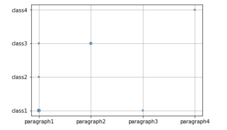
发生的越高,标记就越大。
不同的问题,但同样的答案由@James可以在这里找到:How to have scatter points become larger for higher density using matplotlib?
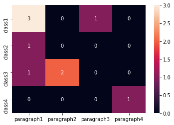
Edit1 (如果您有更大的数据集)使用热图的不同方法:
import numpy as np
from collections import Counter
import seaborn as sns
import pandas as pd

x = ['paragraph1', 'paragraph1','paragraph1','paragraph1','paragraph2', 'paragraph2','paragraph3','paragraph1','paragraph4']
y = ['class1','class1','class1', 'class2','class3','class3', 'class1', 'class3','class4']

# count the occurrences of each point
c = Counter(zip(x,y))

# fill pandas DataFrame with zeros
dff = pd.DataFrame(0,columns =np.unique(x) , index =np.unique(y))

# count occurencies and prepare data for heatmap
for k,v in c.items():
    dff[k[0]][k[1]] = v

sns.heatmap(dff,annot=True, fmt="d")
页面原文内容由Stack Overflow提供。腾讯云小微IT领域专用引擎提供翻译支持
原文链接:
https://stackoverflow.com/questions/55722744
复制相关文章
相似问题
腾讯云开发者

Copyright © 2013 - 2026 Tencent Cloud. All Rights Reserved. 腾讯云 版权所有
深圳市腾讯计算机系统有限公司 ICP备案/许可证号:粤B2-20090059 ![]() 粤公网安备44030502008569号
粤公网安备44030502008569号
腾讯云计算(北京)有限责任公司 京ICP证150476号 | 京ICP备11018762号