
自举网格不均匀柱
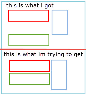
我正在使用引导4网格。我有三栏。我要第一和第三栏是第8栏,第二栏是第4栏。基本上,第二列是一个侧边栏,我想在第一和第三列之间的小屏幕。不幸的是,我的第二列具有动态高度,而且很长,所以第一列得到第二列的指定高度,第三列从第二列的底部开始,在第一列和第三列之间有大量的空间。我希望第3栏正好放在第一栏的案文之下。
我希望这是有意义的。
这就是我想要做的事情的形象:
<div class="container">
    <div class="row ">
      <div class="col-sm-8 ">
        <div>One of three columns</div>
        <div>One of three columns</div>
      </div>
      <div class="col-sm-4 ">
        <div>Two of three columns</div>
        <div>Two of three columns</div>
        <div>Two of three columns</div>
        <div>Two of three columns</div>
        <div>Two of three columns</div>
        <div>Two of three columns</div>
      </div>
      <div class="col-sm-8">
        <div>three of three columns</div>
        <div>three of three columns</div>
        <div>three of three columns</div>
      </div>
    </div>
</div>回答 4
Stack Overflow用户
发布于 2018-10-08 18:16:54
引导带5(更新2021)
引导5还对网格行/列使用flexbox。因此,使用d块响应仍然有效,但是float-left已经被float-start所取代。
引导带4(原始答案)
基本上,这已经有been answered before了。
Bootstrap 4是柔性盒,因此所有的列都成为与最高的列相同的高度。通常,您可以通过嵌套列来解决这个问题,但是这样就无法获得所需的列顺序。解决办法是使用像这样的浮点数:
<div class="container">
    <div class="row d-sm-block">
      <div class="col-sm-8 float-left">
        <div>One of three columns</div>
        <div>One of three columns</div>
      </div>
      <div class="col-sm-4 float-right">
        <div>Two of three columns</div>
        <div>Two of three columns</div>
        <div>Two of three columns</div>
        <div>Two of three columns</div>
        <div>Two of three columns</div>
        <div>Two of three columns</div>
      </div>
      <div class="col-sm-8 float-left">
        <div>three of three columns</div>
        <div>three of three columns</div>
        <div>three of three columns</div>
      </div>
    </div>
</div>演示:https://codeply.com/go/0bUA8clMdI (为可视化添加的边框)
这可以使用row中的row中的display:flex来生成行display:block,而不是sm和up上的display:flex。这允许float-*在列上工作,第二列被拉到右边。
Stack Overflow用户
发布于 2018-10-05 19:28:03
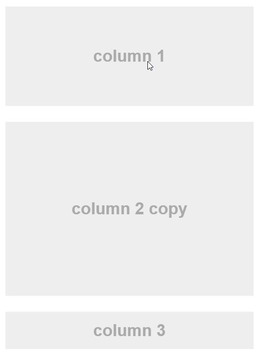
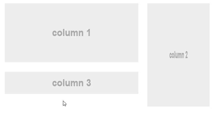
如果您不介意复制您的侧边栏,您可以将侧边栏副本放在第1列和第3列之间,并在小屏幕上显示它,同时在右边隐藏另一个。在大屏幕上,您可以进行相反的操作,在右边显示侧边栏,同时在第1列和第3列之间隐藏副本。
HTML
<div class="container">
  <div class="row">
    <div class="col-sm-8">
        <section class="mb-3">
            column 1
        </section>
        <section class="mb-3 d-sm-none">
            copy of column 2
        </section>
        <section class="mb-3">
            column 3
        </section>
    </div>
    <div class="col-sm-4">
        <section class="mb-3 d-none d-sm-block">
            column 2
        </section>
    </div>
  </div>
</div>
结果
在小屏幕上:
在大屏幕上:
小提琴: http://jsfiddle.net/aq9Laaew/243819/
Stack Overflow用户
发布于 2018-11-30 12:00:19
可以在列内写入行列。
尝尝这个
<div class="container border border-primary">
<div class="row border border-primary">
    <div class="border border-primary col-lg-8 col-md-12 col-sm-12" style="height:200px">
        <div class="row border border-secondary">
            <div class="border border-secondary col-lg-12 col-md-12 col-sm-12" style="height:100px">
                <!--content for 1-->
            </div>
            <div class="border border-secondary col-lg-12 col-md-12 col-sm-12" style="height:100px">
                <!--content for 2-->
            </div>
        </div>
    </div>
    <div class="border border-primary col-lg-4 col-md-6 col-sm-6" style="height:200px">
        <!-content for 3-->
    </div>
</div> https://stackoverflow.com/questions/52668233
复制相似问题
腾讯云开发者

Copyright © 2013 - 2026 Tencent Cloud. All Rights Reserved. 腾讯云 版权所有
深圳市腾讯计算机系统有限公司 ICP备案/许可证号:粤B2-20090059  粤公网安备44030502008569号
腾讯云计算(北京)有限责任公司 京ICP证150476号 | 京ICP备11018762号