
点对齐,沿x轴,下拉线
点对齐,沿x轴,下拉线
提问于 2018-02-15 12:32:48
下面的图表接近我所要寻找的内容,但是我想知道是否有可能实现以下内容:
- 节点的左对齐而不是沿x轴对齐,因此,例如,一个只有2个节点的流将在x轴上完成一半的工作,而不是在x-max时完成(在我的非玩具sankey图中,这是左对齐的,但是,我无法计算出两者之间的差异)。
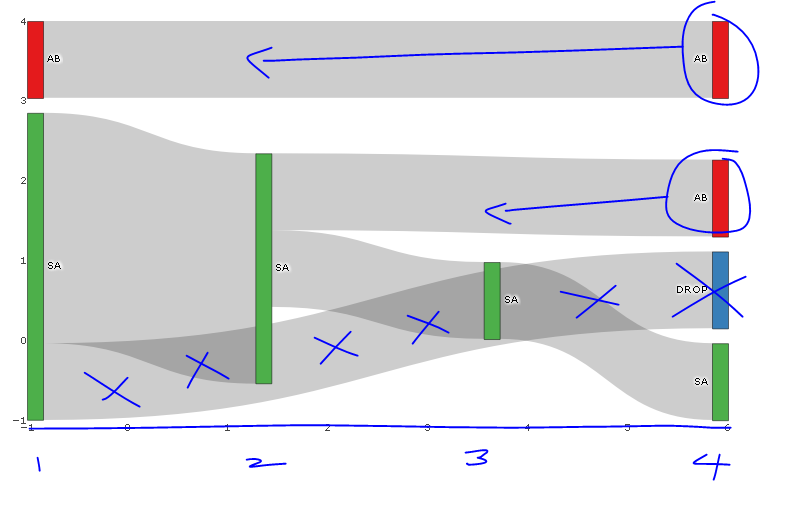
- 仅删除节点上的悬停文本(而不是链接)。我尝试了“标签”、“文本”、“值”、“百分比”、“名称”与"+“或"all”或" none“或”none“或"skip”的各种组合,但这些似乎都没有区别。
- 例如,我不想看到从SA到Drop (蓝色节点)的链接,但是我希望在x=-1处看到绿色栏,以显示一个人在他们的第一个假期去了SA,而没有另一个假期。(如果我离开source=SA和target=NA,图表是空白的)。我建议的工作将是,否则的颜色下降节点和SA下降链接到白色.
已用所需的蓝色更改对图像进行注释。
require(dplyr); require(plotly); require(RColorBrewer); require(stringr)

# Summarise flow data
dat <- data.frame(customer = c(1, 1, 1, 2, 2, 2, 2, 3, 3, 4, 4, 5),
              holiday_loc = c("SA", "SA", "AB", "SA", "SA", "SA", "SA", "AB", "AB", "SA", "SA", "SA")) %>%
  group_by(customer) %>%
          mutate(holiday_num = seq_along(customer),
                 source=paste0(holiday_loc, '_', holiday_num),
                 target = lead(source),
                 last_hol = ifelse(holiday_num == n(), 'Y', 'N')) %>%
  filter(last_hol== 'N'| holiday_num == 1) %>%
  select(-last_hol)

 sank_links <-  dat %>%
   group_by(source, target) %>%
   summarise(n=n()) %>%
   mutate(target=ifelse(is.na(target), "DROP", target)) # is there another option here?

# obtain colours for nodes
f <- function(pal) brewer.pal(brewer.pal.info[pal, "maxcolors"], pal)
cols <- f("Set1")

# set up nodes
sank_nodes <- data.frame(
                      name = factor(sort(unique(c(as.character(sank_links$source),
                                   as.character(sank_links$target)))))
                      ) %>%
                        mutate(label=sub("_[0-9]$", "", name),
                              # for some unknown reason, plotly allows only three labels to be the same
                              label_pad=sub("_[1-3]$", "", name),
                              label_pad=sub("_[4-6]$", " ", label_pad)) %>%
                        arrange(label) %>%
                        mutate(color = cols[cumsum(1-duplicated(label))])

# update links to get index of node and name (without holiday_num)
sank_links <- sank_links %>%
          mutate(source_num = match(source, sank_nodes$name) -1 ,
                 source_name = str_replace(source, "_[0-9]$", ""),
                 target_num = match(target, sank_nodes$name) - 1,
                 target_name = str_replace(target, "_[0-9]$", ""))


# diagram
p <- plot_ly(
  type = "sankey",
  domain = c(
    x =  c(0,1),
    y =  c(0,1)
  ),
  orientation = "h",
  valueformat = ".0f",
  valuesuffix = "Customers",
  arrangement="fixed",


  node = list(
    label = sank_nodes$label_pad,
    color = sank_nodes$color,
    pad = 15,
    thickness = 15,
    line = list(
      color = "black",
      width = 0.5
    )
  ),

  link = list(
    source = sank_links$source_num,
    target = sank_links$target_num,
    value =  sank_links$n
  )
) %>%
  layout(
    title = "",
    font = list(
      size = 10
    ),
    xaxis = list(showgrid = F, zeroline = F),
    yaxis = list(showgrid = F, zeroline = F)
  )

p编辑:我最初不知道如何用与节点对应的断点标记x轴,并提供x轴的标题;代码如下:
    %>%
  layout(
    title = "",
    font = list(
      size = 10
    ),
    xaxis = list(showgrid = F, zeroline = F, title="Holiday Number", tickvals=-1:4, ticktext=1:6),
    yaxis = list(showgrid = F, zeroline = F, showticklabels=FALSE)
)回答 3
Stack Overflow用户
发布于 2020-01-06 18:26:55
实际上,您可以手动覆盖de节点位置(所有节点或只覆盖您想要的节点位置)。
您可以在节点列表中这样做,为x轴添加一个向量,为y轴添加一个向量,其中包含要更改的节点的位置。如果要将节点保持在相同位置,只需将NA添加到该矢量位置即可。
node = list(
    label = sank_nodes$label_pad,
    color = sank_nodes$color,
    pad = 15,
    thickness = 15,
    line = list(
      color = "black",
      width = 0.5
    ),
    x = c(NA, 0.35, 0.65, NA, NA, NA, NA, NA),
    y = c(NA, 0.10, 0.42, NA, NA, NA, NA, NA)
)Stack Overflow用户
发布于 2018-05-01 20:13:46
您不能在Plotly中更改节点的位置,但是如果您将布局从“固定的”更改为“自由的”,则在图表呈现后,您可以手动将节点移动到任何您想要的位置。但是,每次呈现图表时,用户都必须手动完成此操作。目前还无法对中的节点进行排序。
Stack Overflow用户
发布于 2020-05-09 10:05:44
事实上,这是很有可能的。
import plotly.graph_objects as go

fig = go.Figure(go.Sankey(
    arrangement = "snap",
    node = {
        "label": ["A", "B", "C", "D", "E", "F"],
        "x": [0.2, 0.1, 0.5, 0.7, 0.3, 0.5],
        "y": [0.7, 0.5, 0.2, 0.4, 0.2, 0.3],
        'pad':10},  # 10 Pixels
    link = {
        "source": [0, 0, 1, 2, 5, 4, 3, 5],
        "target": [5, 3, 4, 3, 0, 2, 2, 3],
        "value": [1, 2, 1, 1, 1, 1, 1, 2]}))

fig.show()代码来自plotly.com。
页面原文内容由Stack Overflow提供。腾讯云小微IT领域专用引擎提供翻译支持
原文链接:
https://stackoverflow.com/questions/48807397
复制相关文章
相似问题
腾讯云开发者

Copyright © 2013 - 2026 Tencent Cloud. All Rights Reserved. 腾讯云 版权所有
深圳市腾讯计算机系统有限公司 ICP备案/许可证号:粤B2-20090059 ![]() 粤公网安备44030502008569号
粤公网安备44030502008569号
腾讯云计算(北京)有限责任公司 京ICP证150476号 | 京ICP备11018762号