
用分面网格对错误条进行排序?
我已经为这个问题挣扎了几天了--找不到一段代码来帮助我。我在ggplot2中有一个多变量的条形图,我终于把它算出来了,所以它看上去很棒,传达了我想要显示的数据。不幸的是,当我将错误条添加到图形中时,它们都是无序的,并且在整个条形图中浮动。(我的生存危险的条形文字例子)
数据:(谢谢,我忘记了dput)
 > dput(plant_ag)

    structure(list(worms = structure(c(1L, 2L, 1L, 2L, 1L, 2L, 1L,
     2L, 1L, 2L, 1L, 2L), .Label = c("No", "Yes"), class = "factor"),
    poll_level = structure(c(1L, 1L, 2L, 2L, 3L, 3L, 1L, 1L,
    2L, 2L, 3L, 3L), .Label = c("Low", "Medium", "Very"), class = "factor"),
    variable = structure(c(7L, 7L, 7L, 7L, 7L, 7L, 10L, 10L,
    10L, 10L, 10L, 10L), .Label = c("biomass", "cu_seed", "pb_seed",
    "zn_seed", "cu_buck", "pb_buck", "zn_buck", "cu_rye", "pb_rye",
    "zn_rye"), class = "factor"), x.mean = c(0.9945992584, 4.645085363,
    198.390869802, 58.43054462, 3795.1789451, 2883.8860731, 942.59827934,
    1313.1415081, 707.165653286, 1529.33515045, 3811.442312,
    6149.4490085), x.sd = c(3.14519901565836, 14.68904967299,
    176.524518210961, 61.362498383762, 554.023490328341, 541.012498962109,
    224.078432824798, 221.039876468939, 468.567696912978, 1021.25312103485,
    2431.58456925777, 3004.85636935088), x.n = c(10, 10, 10,
    10, 10, 10, 10, 10, 10, 10, 10, 10), se = c(0.9945992584,
    4.645085363, 55.8219540410509, 19.4045257811089, 175.197610667382,
    171.083173933975, 70.8598222247401, 69.8989463364104, 148.174116022446,
    322.948593002573, 768.934556217399, 950.219016881294),
    names = c("No EW/ Low Soil",
    "Yes EW/ Low Soil", "No EW/ Medium Soil", "Yes EW/ Medium Soil",
    "No EW/ Very Soil", "Yes EW/ Very Soil", "No EW/ Low Soil",
    "Yes EW/ Low Soil", "No EW/ Medium Soil", "Yes EW/ Medium Soil",
    "No EW/ Very Soil", "Yes EW/ Very Soil"),
     ymin = c(0, 8.88178419700125e16,
    142.568915760949, 39.0260188388911, 3619.98133443262, 2712.80289916603,
    871.73845711526, 1243.24256176359, 558.991537263554, 1206.38655744743,
    3042.5077557826, 5199.22999161871), ymax = c(1.9891985168,
    9.290170726, 254.212823843051, 77.8350704011089, 3970.37655576738,
    3054.96924703397, 1013.45810156474, 1383.04045443641, 855.339769308446,
    1852.28374345257, 4580.3768682174, 7099.66802538129)),
 .Names =   c("worms",
"poll_level", "variable", "x.mean", "x.sd", "x.n", "se", "names",
"ymin", "ymax"), row.names = c(NA, -12L), class = "data.frame")
>
守则:
###########图从这里开始
library(ggplot2)

p <- ggplot(data = plant_ag, aes(x = factor(worms), fill = factor(variable), y = x.mean,
                                 group=variable))
p <- p + geom_bar(colour="black",stat = "identity",position = position_dodge(.95))
p <- p + facet_grid(. ~ poll_level)
p <- p + geom_errorbar(aes(ymin=plant_ag$ymin, ymax=plant_ag$ymax), width=0.2,  stat="identity",
                       position = position_dodge(1))
          +  facet_wrap(worms ~poll_level, ncol=4)
p <- p + theme_bw () + theme(legend.position = c(0.15, 0.8)) +
  ggtitle("Zinc in Plants by Soil Pollution Level") +ylab("Zn concentration in plants, ppm") +
  xlab("Earthworm Community Present")
p <- p + scale_fill_manual(values=c('darkgray','lightblue'),
                           name="Experimental\nPlant",
                           labels=c("Buckwheat", "Rye"))
p
#########命令结束
任何帮助(或同情)都非常非常欢迎!感谢你们所做的一切,这对我们所有人来说都是不可思议的帮助。
回答 1
Stack Overflow用户
发布于 2016-03-03 17:34:14
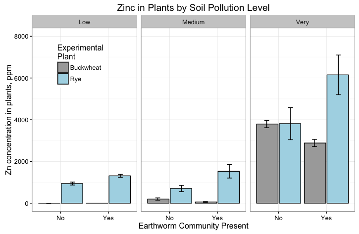
在aes(ymin=ymin, ymax=ymax)中转换为geom_errorbar解决了错误条的排序问题。在对ggplot函数的初始调用中,您已经将数据框架传递给了ggplot,并且不需要再次引用它。在aes中使用geom_errorbar中的数据帧名称将沿着ggplot设置的x轴重写排序,因此错误条是根据它们在数据帧中的顺序绘制的,而不是图中的类别排序。
而且,您的代码有facet_wrap和facet_grid,但是您只能使用其中一个或另一个。下面是更新的绘图代码,facet_wrap注释掉了。我还设置了y标度,因为您的数据对于一个错误条来说有很大的价值,这个错误条破坏了这个图。
下面的代码还展示了如何使用+将绘图组件链接在一起。
p <- ggplot(data = plant_ag, aes(x = factor(worms), fill = factor(variable),
                                 y = x.mean, group=variable)) +
  geom_bar(colour="black", stat="identity", position=position_dodge(.95)) +
  facet_grid(. ~ poll_level) +
  geom_errorbar(aes(ymin=ymin, ymax=ymax), width=0.2, stat="identity",
                position = position_dodge(1)) +
  scale_y_continuous(limits=c(0,8000)) +
#  facet_wrap(worms ~ poll_level, ncol=4) +
  theme_bw() + theme(legend.position = c(0.15, 0.8)) +
  ggtitle("Zinc in Plants by Soil Pollution Level") +
  labs(y="Zn concentration in plants, ppm",
       x="Earthworm Community Present") +
  scale_fill_manual(values=c('darkgray','lightblue'),
                    name="Experimental\nPlant",
                    labels=c("Buckwheat", "Rye"))
https://stackoverflow.com/questions/35763208
复制相似问题
腾讯云开发者

Copyright © 2013 - 2026 Tencent Cloud. All Rights Reserved. 腾讯云 版权所有
深圳市腾讯计算机系统有限公司 ICP备案/许可证号:粤B2-20090059 ![]() 粤公网安备44030502008569号
粤公网安备44030502008569号
腾讯云计算(北京)有限责任公司 京ICP证150476号 | 京ICP备11018762号