
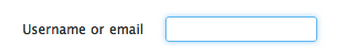
如何使色彩缤纷的渐变辉光围绕您的输入框?
我知道,对于方框周围的蓝光,我们只需将下面的代码应用于CSS:
.glowing-border {
    border: 2px solid #dadada;
    border-radius: 7px;
}

.glowing-border:focus {
    outline: none;
    border-color: #9ecaed;
    box-shadow: 0 0 10px #9ecaed;
}
现在我想把我的输入盒提升到一个更高的水平。
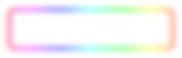
我希望它看起来像这样-而不是蓝光。我想要有一个很好的彩虹梯度效应。
有没有CSS专家认为这对我来说是可行的?
不必是CSS,如果有人对如何以不同的方式完成这件事有任何建议--请留下评论或回答。
回答 4
Stack Overflow用户
发布于 2014-12-06 22:14:24
我认为您可以通过使用两个额外的divs来做到这一点。一个用于羽毛效果的白色内嵌框阴影(也具有背景梯度),另一个是在输入区域后面的一个带有白色背景和外部框阴影的div。
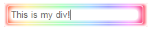
我以为你的背景色是白色的。
.rainbowWrap {
    width: 200px;
    background: //your gradient...
    padding: 4px;
    box-shadow: inset 0px 0px 5px 3px white;
    border-radius: 2px;
    position:relative;
    z-index: 1;
}

.rainbowBg {
    width: 184px;
    height:15px;
    background: white;
    position:absolute;
    top: 10px;
    left: 10px;
    box-shadow: 0px 0px 7px 2px white, 0px 0px 13px 2px white;
    border-radius: 4px;
    z-index: 2;
}

.rainbow {
    width:186px;
    background:transparent;
    border:1px solid rgba(255,255,255,0.5);
    padding: 5px;
    border-radius: 4px;
    outline:none;
    display: block;
    position:relative;
    z-index: 500;
    color:#666;
}
请注意,我只编写了代码,并且只在中进行了测试。
小提琴:http://jsfiddle.net/b03acbdu/5/
Stack Overflow用户
发布于 2014-12-06 20:49:55
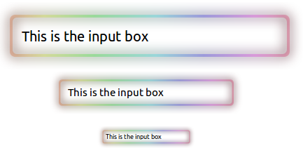
这是一个svg解决方案。
input元素位于svg中,并且它是透明的,因此看起来svg是input元素的边框。
input {
  position: absolute;
  color: black;
  background: transparent;
  border: none;
}
.input-container-1,
.input-container-2,
.input-container-3 {
  overflow-x: hidden;
}
.input-container-1 {
  position: relative;
  left: -100px;
  width: 640px;
}
.input-1 {
  width: 360px;
  height: 24px;
  top: 35px;
  left: 136px;
  font-size: 20px;
}
.input-container-2 {
  position: relative;
  left: 15px;
  width: 400px;
}
.input-2 {
  width: 217px;
  height: 17px;
  top: 20px;
  left: 87px;
  font-size: 15px;
}
.input-container-3 {
  position: relative;
  left: 115px;
  width: 200px;
}
.input-3 {
  width: 110px;
  height: 9px;
  top: 24px;
  left: 43px;
  font-size: 9px;
}<svg width="0" height="0">
<defs>
<linearGradient id="linearGradient4466">
<stop style="stop-color:#3d0f00;stop-opacity:1" offset="0" />
<stop offset="0.11958463" style="stop-color:#3b3d00;stop-opacity:1" />
<stop offset="0.29933503" style="stop-color:#013d00;stop-opacity:1" />
<stop offset="0.52438051" style="stop-color:#003d3d;stop-opacity:1" />
<stop offset="0.69545531" style="stop-color:#00003d;stop-opacity:1" />
<stop offset="0.88148439" style="stop-color:#3d003d;stop-opacity:1" />
<stop style="stop-color:#38000d;stop-opacity:1" offset="1" />
</linearGradient>
<linearGradient id="linearGradient3978">
<stop offset="0" style="stop-color:#ffd4bf;stop-opacity:1" />
<stop style="stop-color:#f8ffbf;stop-opacity:1" offset="0.11958463" />
<stop style="stop-color:#bfffc0;stop-opacity:1" offset="0.29933503" />
<stop style="stop-color:#bffbff;stop-opacity:1" offset="0.52438051" />
<stop style="stop-color:#c2bfff;stop-opacity:1" offset="0.69545531" />
<stop style="stop-color:#febfff;stop-opacity:1" offset="0.88148439" />
<stop offset="1" style="stop-color:#ffbfd2;stop-opacity:1" />
</linearGradient>
<linearGradient id="linearGradient3924">
<stop style="stop-color:#ffd4bf;stop-opacity:1" offset="0" />
<stop offset="0.03125" style="stop-color:#ffd5bf;stop-opacity:1;" />
<stop offset="0.0625" style="stop-color:#ffd6bf;stop-opacity:1;" />
<stop offset="0.125" style="stop-color:#ffd8bf;stop-opacity:1;" />
<stop offset="0.25" style="stop-color:#ffddbf;stop-opacity:1;" />
<stop offset="0.5" style="stop-color:#ffe6bf;stop-opacity:1;" />
<stop style="stop-color:#fff8bf;stop-opacity:1" offset="1" />
</linearGradient>
<linearGradient xlink:href="#linearGradient3924" x1="1390.6012" y1="-164.2403" x2="1397.4197" y2="-164.24028" gradientUnits="userSpaceOnUse" />
<linearGradient xlink:href="#linearGradient3978" gradientUnits="userSpaceOnUse" x1="1390.6012" y1="-164.11403" x2="1489.2173" y2="-164.49281" gradientTransform="matrix(1.0010509,0,0,1.0060612,-93.175264,9.3454472)" />
<linearGradient xlink:href="#linearGradient3978" gradientUnits="userSpaceOnUse" gradientTransform="matrix(1.0010509,0,0,1.0060612,-93.10075,-49.919881)" x1="1390.6012" y1="-164.11403" x2="1489.2173" y2="-164.49281" />
<linearGradient xlink:href="#linearGradient4466" gradientUnits="userSpaceOnUse" gradientTransform="matrix(1.0010509,0,0,1.0060612,-93.100798,-49.919876)" x1="1390.6012" y1="-164.11403" x2="1489.2173" y2="-164.49281" />
<filter id="filter4482" color-interpolation-filters="sRGB" x="-0.30000001" y="-0.30000001" width="1.6" height="1.6">
<feBlend blend="normal" mode="screen" in2="SourceGraphic" result="result93" />
<feComposite in="SourceGraphic" operator="over" result="result92" in2="result93" />
<feGaussianBlur stdDeviation="2" result="result91" />
</filter>
<linearGradient xlink:href="#linearGradient3978" id="linearGradient4494" gradientUnits="userSpaceOnUse" gradientTransform="matrix(1.0010509,0,0,1.0060612,-93.10075,-49.919881)" x1="1390.6012" y1="-164.11403" x2="1489.2173" y2="-164.49281" />
<linearGradient xlink:href="#linearGradient4466" id="linearGradient4496" gradientUnits="userSpaceOnUse" gradientTransform="matrix(1.0010509,0,0,1.0060612,-93.100798,-49.919876)" x1="1390.6012" y1="-164.11403" x2="1489.2173" y2="-164.49281" />
<g id="shape" transform="translate(0,-1028.3622)">
<g transform="translate(-1268.4495,1255.3775)">
<path d="m 1300.3557,-222.51533 c -1.0545,0 -1.9062,0.85169 -1.9062,1.90625 l 0,11.1875 c 0,1.05456 0.8517,1.90625 1.9062,1.90625 l 96.1876,0 c 1.0545,0 1.9062,-0.85169 1.9062,-1.90625 l 0,-11.1875 c 0,-1.05456 -0.8517,-1.90625 -1.9062,-1.90625 l -96.1876,0 z m 0.6563,1 94.8437,0 c 0.8743,0 1.5938,0.68825 1.5938,1.5625 l 0,9.84375 c 0,0.87425 -0.7195,1.59375 -1.5938,1.59375 l -94.8437,0 c -0.8743,0 -1.5625,-0.7195 -1.5625,-1.59375 l 0,-9.84375 c 0,-0.87425 0.6882,-1.5625 1.5625,-1.5625 z"
style="fill:url(#linearGradient4494);fill-opacity:1;stroke:none" />
<path style="fill:url(#linearGradient4496);fill-opacity:1;stroke:none;filter:url(#filter4482)" d="m 1300.3557,-222.51533 c -1.0545,0 -1.9062,0.85169 -1.9062,1.90625 l 0,11.1875 c 0,1.05456 0.8517,1.90625 1.9062,1.90625 l 96.1876,0 c 1.0545,0 1.9062,-0.85169 1.9062,-1.90625 l 0,-11.1875 c 0,-1.05456 -0.8517,-1.90625 -1.9062,-1.90625 l -96.1876,0 z m 0.6563,1 94.8437,0 c 0.8743,0 1.5938,0.68825 1.5938,1.5625 l 0,9.84375 c 0,0.87425 -0.7195,1.59375 -1.5938,1.59375 l -94.8437,0 c -0.8743,0 -1.5625,-0.7195 -1.5625,-1.59375 l 0,-9.84375 c 0,-0.87425 0.6882,-1.5625 1.5625,-1.5625 z"
/>
</g>
</g>
</defs>
</svg>
<div class="input-container-1">
<svg width="640" height="96" viewBox="0 0 160 24">
<use xlink:href="#shape" />
</svg>
<input type="text" class="input-1" value="This is the input box" />
</div>
<div class="input-container-2">
<svg width="400" height="60" viewBox="0 0 160 24">
<use xlink:href="#shape" />
</svg>
<input type="text" class="input-2" value="This is the input box" />
</div>
<div class="input-container-3">
<svg width="200" height="60" viewBox="0 0 160 24">
<use xlink:href="#shape" />
</svg>
<input type="text" class="input-3" value="This is the input box" />
</div>
Stack Overflow用户
发布于 2014-12-06 18:45:43
我会用背景图片来做:
#it:focus {
   outline: none;
   border: none;
   box-shadow: none;
   padding: 20px 0px;

   background: url('http://i.stack.imgur.com/XbM0u.png') no-repeat;
   background-size: 100%;
}
调整填充以匹配实际的图像(更多地关注长宽比而不是像素,因此它很好地缩放),然后对非聚焦的情况做同样的事情。#这是一个输入。您应该能够使用包装器元素来完成这个任务。
background-size将使它适合任何地方,只要你有正确的百分比。
https://stackoverflow.com/questions/27335015
复制相似问题
腾讯云开发者

Copyright © 2013 - 2026 Tencent Cloud. All Rights Reserved. 腾讯云 版权所有
深圳市腾讯计算机系统有限公司 ICP备案/许可证号:粤B2-20090059  粤公网安备44030502008569号
腾讯云计算(北京)有限责任公司 京ICP证150476号 | 京ICP备11018762号