
如何在python中绘制条
如何在python中绘制条
提问于 2014-04-10 22:33:08
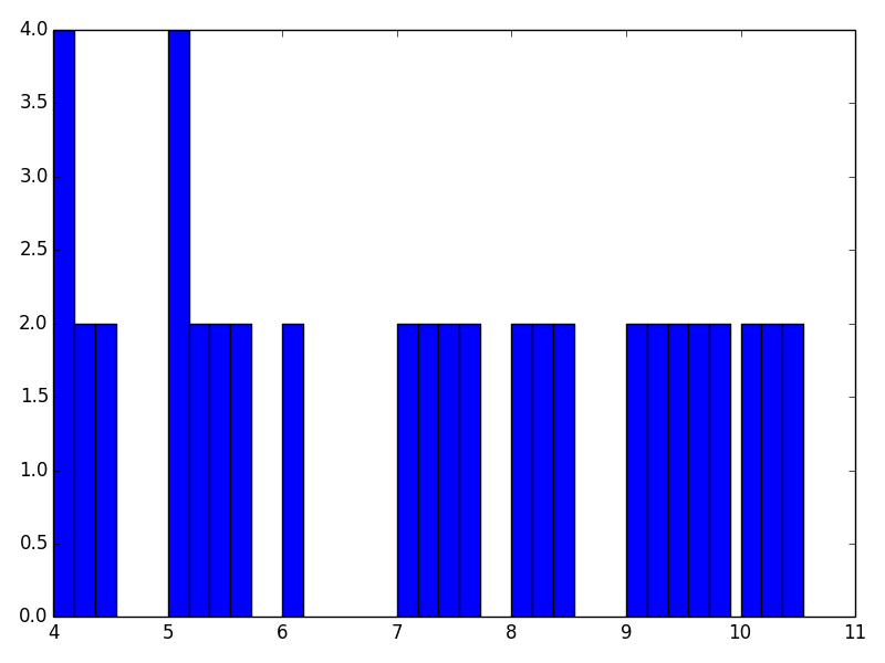
我想为下面的数据绘制条形图:
4  1406575305  4
4  -220936570  2
4  2127249516  2
5  -1047108451  4
5  767099153  2
5  1980251728  2
5  -2015783241  2
6  -402215764  2
7  927697904  2
7  -631487113  2
7  329714360  2
7  1905727440  2
8  1417432814  2
8  1906874956  2
8  -1959144411  2
9  859830686  2
9  -1575740934  2
9  -1492701645  2
9  -539934491  2
9  -756482330  2
10  1273377106  2
10  -540812264  2
10  318171673  2
第一列是x轴,第三列是y轴。同一x轴值存在多个数据.例如,
4  1406575305  4
4  -220936570  2
4 2127249516 2这意味着4个x轴值的三个条形图,每个条形图都有标记(中间列中的值)。示例条形图如下:demo.html
我使用的是matplotlib.pyplot和np。谢谢..
回答 1
Stack Overflow用户
回答已采纳
发布于 2014-04-11 00:58:24
我遵循了您所链接的教程,但要将它们转换为一个不一致的数量有点棘手:
import numpy as np
import matplotlib.pyplot as plt

x, label, y = np.genfromtxt('tmp.txt', dtype=int, unpack=True)

ux, uidx, uinv = np.unique(x, return_index=True, return_inverse=True)
max_width = np.bincount(x).max()
bar_width = 1/(max_width + 0.5)

locs = x.astype(float)
shifted = []
for i in range(max_width):
    where = np.setdiff1d(uidx + i, shifted)
    locs[where[where<len(locs)]] += i*bar_width
    shifted = np.concatenate([shifted, where])

plt.bar(locs, y, bar_width)
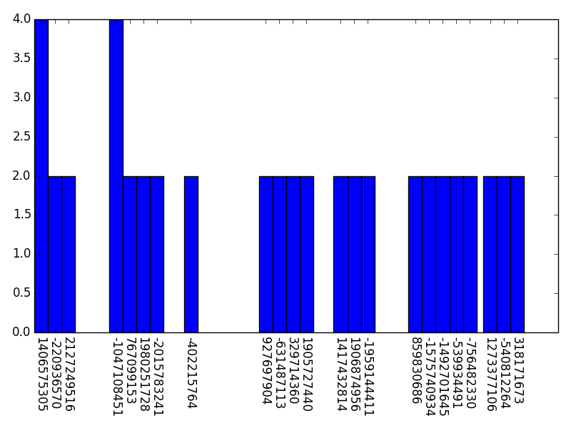
如果需要,可以用第二列而不是x标记它们:
plt.xticks(locs + bar_width/2, label, rotation=-90)
我会把做这两件事作为练习留给读者(主要是因为我不知道你想让他们怎样出现)。
页面原文内容由Stack Overflow提供。腾讯云小微IT领域专用引擎提供翻译支持
原文链接:
https://stackoverflow.com/questions/23000278
复制相关文章
相似问题
腾讯云开发者

Copyright © 2013 - 2026 Tencent Cloud. All Rights Reserved. 腾讯云 版权所有
深圳市腾讯计算机系统有限公司 ICP备案/许可证号:粤B2-20090059 ![]() 粤公网安备44030502008569号
粤公网安备44030502008569号
腾讯云计算(北京)有限责任公司 京ICP证150476号 | 京ICP备11018762号