
这种堆叠的方块效果可以只用CSS来完成吗?
这种堆叠的方块效果可以只用CSS来完成吗?
提问于 2013-09-18 18:36:36
我见过其他复杂的效果是用CSS做的,就像堆叠的纸效果:
http://jsfiddle.net/thefrontender/LwW7g/
<div class="slide expandable-slide">Title</div>
<div class="slide">Title</div>

.slide {
    float: left;
    display: block;
    position: relative;
    background: #FFF;
    height: 10em;
    width: 10em;
    padding: 1em;
    border: solid 2px #000;
    margin-right: 2em;
}

.expandable-slide {
    margin: 2em 2em 0 2em;
    box-shadow: -1em -1em #666,
                -2em -2em #333;
}
我的需求是非常相似的,除了两个外部边缘需要与主要的额叶div连接:
有人知道有什么花招能让这一切成为可能吗?
回答 4
Stack Overflow用户
回答已采纳
发布于 2013-09-18 18:59:27
您可以堆叠多个方框阴影以达到您想要的效果:
.slide {
    height: 200px;
    width: 100px;
    padding: 1em;
    border: solid 2px #000;
}
.expandable-slide {
    margin: 10px 10px 0 10px;
    box-shadow: 1px 1px #999,
        2px 2px #999,
        3px 3px #999,
        4px 4px #999,
        5px 5px #999,
        6px 6px #999,
        7px 7px #999,
        8px 8px #999,
        9px 9px #999,
        10px 10px #999;
}
jsFiddle实例
Stack Overflow用户
发布于 2013-09-18 18:45:35
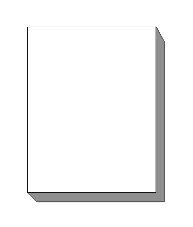
如果您能够使用CSS伪元素:
.slide {
    position: relative;
    width: 200px; /* arbitrary, adjust to taste */
    height: 500px; /* arbitrary, adjust to taste */
    border: 2px solid #000;
    border-right-width: 40px; /* this is the 'depth' of the 'sides' */
    border-bottom-width: 40px;
}

.slide::before {
    content: '';
    position: absolute;
    top: -2px; /* to cover the top of the border */
    left: 100%;
    border: 20px solid #fff;
    border-bottom-color: transparent; /* allows the containing element's border to be seen */
    border-left-color: transparent;
}

.slide::after {
    content: '';
    position: absolute;
    top: 100%;
    left: -2px;
    border: 20px solid #fff;
    border-top-color: transparent;
    border-right-color: transparent;
}
JS Fiddle演示。
上面使用的HTML如下:
<div class="slide">Title</div>Stack Overflow用户
发布于 2013-09-18 18:58:13
你可以这样做(不是最优雅的,而是很有魅力的):
.expandable-slide {
    margin: 2em 2em 0 2em;
    box-shadow: 0.05em 0.05em #555,
                 0.1em 0.1em #555,
                 0.15em 0.15em #555,
                 0.2em 0.2em #555,
                 0.25em 0.25em #555,
                 0.3em 0.3em #555,
                 0.35em 0.35em #555,
                 0.4em 0.4em #555,
                 0.45em 0.45em #555,
                 0.5em 0.5em #555
        ;
}
小提琴
页面原文内容由Stack Overflow提供。腾讯云小微IT领域专用引擎提供翻译支持
原文链接:
https://stackoverflow.com/questions/18879808
复制相关文章
相似问题
腾讯云开发者

Copyright © 2013 - 2026 Tencent Cloud. All Rights Reserved. 腾讯云 版权所有
深圳市腾讯计算机系统有限公司 ICP备案/许可证号:粤B2-20090059  粤公网安备44030502008569号
腾讯云计算(北京)有限责任公司 京ICP证150476号 | 京ICP备11018762号