
有没有办法在海运散点图(网格图)上做这个?python
有没有办法在海运散点图(网格图)上做这个?python
提问于 2020-11-26 17:17:05
嗨,我正在做一个数据分析,我需要做一些散点图,但是我必须在一个3x3块的网格中这样做,.for例子,我读取一个csv文件,并将它作为数据frame.From存储--数据框架,我选择了一些列来绘制这些散点图。假设列的名称为:1)x 2)y 3)z 4)a 5)bE 29E 1106)cE 211我需要制作的散点图如下:
1-4 2-4 3-4
1-5 2-5 3-5
1-6 2-6 3-6
它必须被看作是
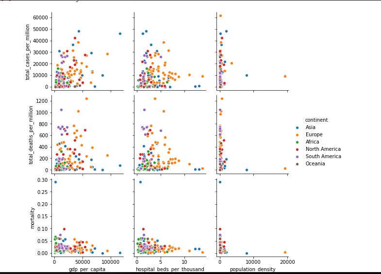
我使用了这个函数sns.pairplots它的话很好,但是我必须用for 循环来做这个,有什么方法可以这样做吗?请告诉我
这是我的代码:
df=pd.read_csv("owid-covid-data.csv")
//it has a lot of columns there but i want only 6.
states=['total_cases_per_million','total_deaths_per_million','mortality','gdp_per_capita','hospital_beds_per_thousand','population_density']
fig,ax=plt.subplots(3,3,figsize=(5,5))
for i ,state in enumerate(states[0:5]):
    x_var=state
    y_var=state
sns.scatterplot(data=new_df,x=x_var,y=y_var,ax=ax[i],hue='continent')回答 1
Stack Overflow用户
发布于 2020-11-26 20:24:22
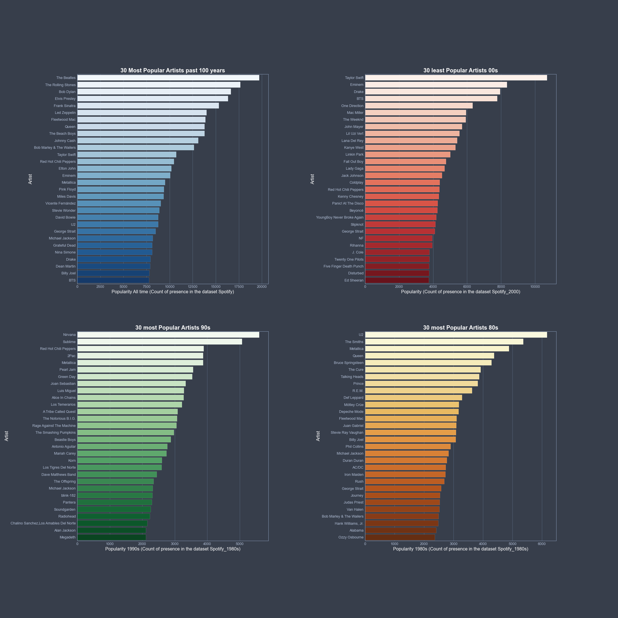
是的,有。下面是一个示例,它显示了网格应该遵循的结构。在这里,4乘以4和barplots,但是对于散点图和更多的图,它的工作方式是相同的:
我使用的数据是160 K歌曲的Spotify数据。因此,第一件事是通过gs = gridspec.GridSpec(100,100)定义图像和网格的大小。第二步是分割你的情节。就我而言:
ax1 = fig1.add_subplot(gs[0:45,0:40])
ax2 = fig1.add_subplot(gs[0:45,60:100])
ax3 = fig1.add_subplot(gs[55:100,0:40])
ax4 = fig1.add_subplot(gs[55:100,60:100])
在那之后,就是所有的阴谋。
fig1 = plt.figure(figsize=[30,30])
gs  = gridspec.GridSpec(100,100)

ax1 = fig1.add_subplot(gs[0:45,0:40])
ax2 = fig1.add_subplot(gs[0:45,60:100])
ax3 = fig1.add_subplot(gs[55:100,0:40])
ax4 = fig1.add_subplot(gs[55:100,60:100])

lead_artists1 = Spotify.groupby('artists')['popularity'].sum().sort_values(ascending=False).head(30)
ax1 = sns.barplot(x=lead_artists1.values, y=lead_artists1.index, palette="Blues", orient="h", edgecolor='white', ax=ax1)
ax1.set_xlabel('Popularity All time (Count of presence in the dataset Spotify)', c='w', fontsize=16)
ax1.set_ylabel('Artist', c='w', fontsize=16)
ax1.set_title('30 Most Popular Artists past 100 years', c='w', fontsize=20, weight = 'bold')


###More plots

fig1.savefig('...../Graphs/Popularity.png')
plt.show()
这个给
页面原文内容由Stack Overflow提供。腾讯云小微IT领域专用引擎提供翻译支持
原文链接:
https://stackoverflow.com/questions/65026607
复制相关文章
相似问题
腾讯云开发者

Copyright © 2013 - 2026 Tencent Cloud. All Rights Reserved. 腾讯云 版权所有
深圳市腾讯计算机系统有限公司 ICP备案/许可证号:粤B2-20090059 ![]() 粤公网安备44030502008569号
粤公网安备44030502008569号
腾讯云计算(北京)有限责任公司 京ICP证150476号 | 京ICP备11018762号