
将X轴变量重命名为分离当前月份数据和前一个月份数据
将X轴变量重命名为分离当前月份数据和前一个月份数据
提问于 2020-12-02 16:05:04
嗨,伙计们,我有医院的数据,看起来像这样;
hospitals <- c('Johnd Hospital','Johnd Hospital','Jolie Hope Hospital','Jolie Hope Hospital','Hope Hospital','Hope Hospital')
variables <- c('temperature', 'temperature', 'pulse rate','pulse rate', 'resp rate', 'resp rate')
score <- c(92,82,63,78, 23, 59)
months <- c('october', 'september', 'october', 'september', 'october', 'september')

datat <- data.frame(hospitals, variables, score, months)

datat$colour <- ifelse(datat$score >=90, "seagreen3",
                           ifelse(datat$score > 80 & datat$score <= 89, "gold1",
                                  ifelse(datat$score > 60 & datat$score <= 79, "plum2", "red3")))
#performance scores
datat$perfomance <- ifelse(as.numeric(datat$score) >=90, "Excellent Perfomance (>=90)%",
                               ifelse(as.numeric(datat$score) >= 80 & as.numeric(datat$score) <= 89, "Good Perfomance (80-89)%",
                                      ifelse(as.numeric(datat$score) > 60 & as.numeric(datat$score) <= 79, "Some Perfomance (60-79)%", "Poor Perfomance (<60)%")))

nam = c("Good Perfomance (80-89)%", "Some Perfomance (60-79)%", "Poor Perfomance (<60)%", "Excellent Perfomance (>=90)%")
grays = c("gold1", "plum2", "red3", "seagreen3")

my_color <- setNames(grays, nam)
my_color
现在,我想绘制当前月份和前一个月变量的性能。直到现在,我才能为本月和上个月的可变分数可视化一个躲闪条形图。一个例子是一个像温度这样的变量,这个月和上个月我有两个条子。以下是我的想象
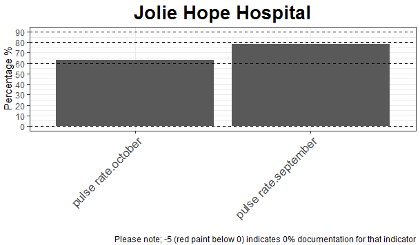
myplott <- function(datat, hospital) {

  print(paste0("Plot for hospital: ", hospital))

  p <- ggplot(datat%>% filter(hospitals == hospital),
              aes(x = variables, y = as.numeric(score))) +
    #facet_grid(cols = vars(Group), scales = "free", space = "free") +
    geom_bar(position = "dodge2", stat = "identity") +
    theme_bw() +
    ylab("Percentage %") +
    scale_y_continuous(breaks = seq(-10, 100, by = 10)) +
    ggtitle(hospital) +
    labs(caption = "Please note; -5 (red paint below 0) indicates 0% documentation for that indicator") +
    ### use manual color here
    scale_fill_manual(values = my_color) +

    theme(axis.text.x = element_text(size = 13, hjust = 1, angle = 45)) +
    geom_hline(yintercept = 90, linetype = "dashed", color = "black", size = 0.5) +
    geom_hline(yintercept = 80, linetype = "dashed", color = "black", size = 0.5) +
    geom_hline(yintercept = 60, linetype = "dashed", color = "black", size = 0.5) +
    geom_hline(yintercept = 0, linetype = "dashed", color = "black", size = 0.5) +
    #geom_text(aes(label = value), vjust = 0, color = "black", size = 2.8) +
    theme(plot.title = element_text(face = "bold", hjust = 0.5, size = 20), legend.position = "top") +
    #theme(plot.subtitle.title = element_text('Admission and during admission vitals monitored')) +
    theme(legend.title = element_blank())

  return(p)

}
myplott(comb.data, "Jolie Hope Hospital")
我现在的斗争是如何在X轴上命名条子,这样一个人就可以知道上个月和当月的条形图,比如把温度命名为温度(10月)和温度(11月)。最终结果是在X轴上重命名本月和上个月的变量分数。如果有人知道我如何命名X轴上的条形图,敬请帮助。谢谢
回答 1
Stack Overflow用户
回答已采纳
发布于 2020-12-02 16:15:44
一种方法可以是使用interaction()
library(ggplot2)
#Function
myplott <- function(datat, hospital) {

  print(paste0("Plot for hospital: ", hospital))

  p <- ggplot(datat%>% filter(hospitals == hospital),
              aes(x = interaction(variables,months), y = as.numeric(score))) +
    #facet_grid(cols = vars(Group), scales = "free", space = "free") +
    geom_bar(position = "dodge2", stat = "identity") +
    theme_bw() +
    ylab("Percentage %") +
    scale_y_continuous(breaks = seq(-10, 100, by = 10)) +
    ggtitle(hospital) +
    labs(caption = "Please note; -5 (red paint below 0) indicates 0% documentation for that indicator") +
    ### use manual color here
    scale_fill_manual(values = my_color) +
    #geom_text(aes(label=months),position = position_dodge2(0.9),vjust=-0.5)+
    theme(axis.text.x = element_text(size = 13, hjust = 1, angle = 45)) +
    geom_hline(yintercept = 90, linetype = "dashed", color = "black", size = 0.5) +
    geom_hline(yintercept = 80, linetype = "dashed", color = "black", size = 0.5) +
    geom_hline(yintercept = 60, linetype = "dashed", color = "black", size = 0.5) +
    geom_hline(yintercept = 0, linetype = "dashed", color = "black", size = 0.5) +
    theme(plot.title = element_text(face = "bold", hjust = 0.5, size = 20), legend.position = "top") +
    #theme(plot.subtitle.title = element_text('Admission and during admission vitals monitored')) +
    theme(legend.title = element_blank())+
    xlab('')

  return(p)

}
#Apply
myplott(datat, "Jolie Hope Hospital")
输出:
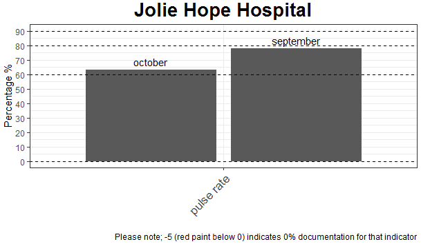
或者在我看来,最优雅的是:
#Function 2
myplott <- function(datat, hospital) {

  print(paste0("Plot for hospital: ", hospital))

  p <- ggplot(datat%>% filter(hospitals == hospital),
              aes(x = variables, y = as.numeric(score))) +
    #facet_grid(cols = vars(Group), scales = "free", space = "free") +
    geom_bar(position = "dodge2", stat = "identity") +
    theme_bw() +
    ylab("Percentage %") +
    scale_y_continuous(breaks = seq(-10, 100, by = 10)) +
    ggtitle(hospital) +
    labs(caption = "Please note; -5 (red paint below 0) indicates 0% documentation for that indicator") +
    ### use manual color here
    scale_fill_manual(values = my_color) +
    geom_text(aes(label=months),position = position_dodge2(0.9),vjust=-0.5)+
    theme(axis.text.x = element_text(size = 13, hjust = 1, angle = 45)) +
    geom_hline(yintercept = 90, linetype = "dashed", color = "black", size = 0.5) +
    geom_hline(yintercept = 80, linetype = "dashed", color = "black", size = 0.5) +
    geom_hline(yintercept = 60, linetype = "dashed", color = "black", size = 0.5) +
    geom_hline(yintercept = 0, linetype = "dashed", color = "black", size = 0.5) +
    theme(plot.title = element_text(face = "bold", hjust = 0.5, size = 20), legend.position = "top") +
    #theme(plot.subtitle.title = element_text('Admission and during admission vitals monitored')) +
    theme(legend.title = element_blank())+
    xlab('')

  return(p)

}
#Apply
myplott(datat, "Jolie Hope Hospital")
输出:
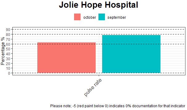
更新:
#Function 3
myplott <- function(datat, hospital) {

  print(paste0("Plot for hospital: ", hospital))

  p <- ggplot(datat%>% filter(hospitals == hospital),
              aes(x = variables, y = as.numeric(score),fill=months)) +
    #facet_grid(cols = vars(Group), scales = "free", space = "free") +
    geom_bar(position = "dodge2", stat = "identity") +
    theme_bw() +
    ylab("Percentage %") +
    scale_y_continuous(breaks = seq(-10, 100, by = 10)) +
    ggtitle(hospital) +
    labs(caption = "Please note; -5 (red paint below 0) indicates 0% documentation for that indicator") +
    ### use manual color here
    #scale_fill_manual(values = my_color) +
    # geom_text(aes(label=months),position = position_dodge2(0.9),vjust=-0.5)+
    theme(axis.text.x = element_text(size = 13, hjust = 1, angle = 45)) +
    geom_hline(yintercept = 90, linetype = "dashed", color = "black", size = 0.5) +
    geom_hline(yintercept = 80, linetype = "dashed", color = "black", size = 0.5) +
    geom_hline(yintercept = 60, linetype = "dashed", color = "black", size = 0.5) +
    geom_hline(yintercept = 0, linetype = "dashed", color = "black", size = 0.5) +
    theme(plot.title = element_text(face = "bold", hjust = 0.5, size = 20), legend.position = "top") +
    #theme(plot.subtitle.title = element_text('Admission and during admission vitals monitored')) +
    theme(legend.title = element_blank())+
    xlab('')

  return(p)

}
#Apply
myplott(datat, "Jolie Hope Hospital")
输出:
页面原文内容由Stack Overflow提供。腾讯云小微IT领域专用引擎提供翻译支持
原文链接:
https://stackoverflow.com/questions/65111753
复制相关文章
相似问题
腾讯云开发者

Copyright © 2013 - 2026 Tencent Cloud. All Rights Reserved. 腾讯云 版权所有
深圳市腾讯计算机系统有限公司 ICP备案/许可证号:粤B2-20090059 ![]() 粤公网安备44030502008569号
粤公网安备44030502008569号
腾讯云计算(北京)有限责任公司 京ICP证150476号 | 京ICP备11018762号