
当试图构建饼图时,r不显示百分比
当试图构建饼图时,r不显示百分比
提问于 2021-06-02 19:48:43
这就是我写的代码:
gender=Survey$`To_which_gender_you_identify_the_most?`
gender<-as.factor(gender)
count=c("Prefer not to say","Male","Female")
pie(table(gender),labels=c(paste0(count)))
我试图创建一个饼图,显示百分比,但百分比没有显示。样本数据
德普特
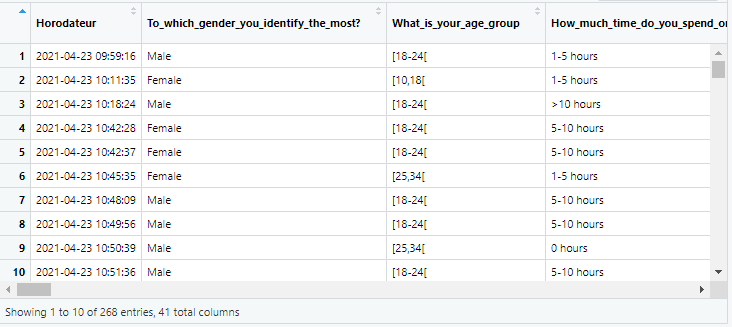
> dput(head(Survey[1:4]))
structure(list(Horodateur = structure(c(1619171956.596, 1619172695.039,
1619173104.83, 1619174548.534, 1619174557.538, 1619174735.457
), class = c("POSIXct", "POSIXt"), tzone = "UTC"), `To_which_gender_you_identify_the_most?` = c("Male",
"Female", "Male", "Female", "Female", "Female"), What_is_your_age_group = c("[18-24[",
"[10,18[", "[18-24[", "[18-24[", "[18-24[", "[25,34["), How_much_time_do_you_spend_on_social_media = c("1-5 hours",
"1-5 hours", ">10 hours", "5-10 hours", "5-10 hours", "1-5 hours"
)), row.names = c(NA, 6L), class = c("tbl_df", "tbl", "data.frame"
))
> 回答 1
Stack Overflow用户
回答已采纳
发布于 2021-06-02 20:59:25
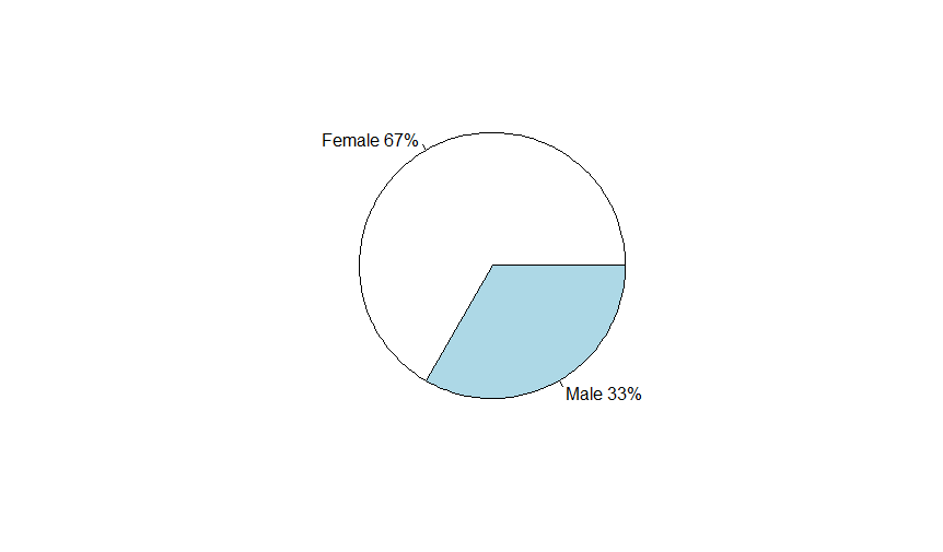
更新.基于更新的示例数据,此代码将根据请求生成标有百分比的饼图。
#your example data
Survey<-structure(list(
    Horodateur = structure(c(1619171956.596, 1619172695.039, 1619173104.83, 1619174548.534, 1619174557.538, 1619174735.457), class = c("POSIXct", "POSIXt"), tzone = "UTC"),
    `To_which_gender_you_identify_the_most?` = c("Male", "Female", "Male", "Female", "Female", "Female"),
    What_is_your_age_group = c("[18-24[", "[10,18[", "[18-24[", "[18-24[", "[18-24[", "[25,34["),
    How_much_time_do_you_spend_on_social_media = c("1-5 hours", "1-5 hours", ">10 hours", "5-10 hours", "5-10 hours", "1-5 hours")),
row.names = c(NA, 6L), class = c("tbl_df", "tbl", "data.frame"))
#make a dataframe of a gender table
gender<-data.frame(table(Survey$`To_which_gender_you_identify_the_most?`))
#add a percentages to the labels. Don't use 'count' to label unless you are sure it mataches the order of your data. More on that below.
pie(gender$Freq,labels=c(paste0(gender$Var1," ",round(100*gender$Freq/length(Survey$`To_which_gender_you_identify_the_most?`), digits = 0),"%")))
结果:
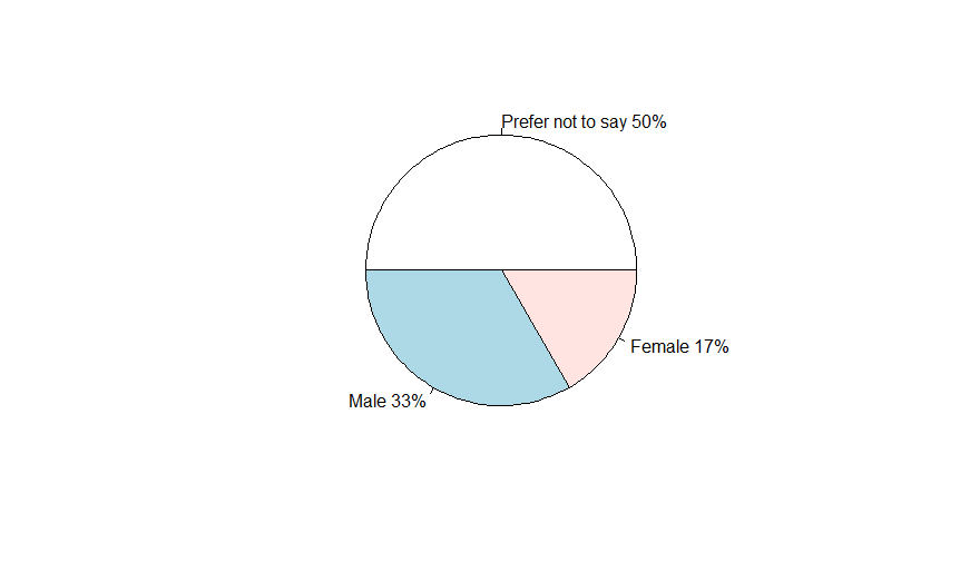
原件.--您需要在pie()中向label=中添加某种百分比计算。当前代码所做的就是用名为count的字符向量标记饼图。试一试:
#make a dataframe out of the table of your gender object
your_table<-data.frame(table(gender))
#add a percentages to the labels. Don't use 'count' to label unless you are sure it mataches the order of your data. More on that below.
pie(your_table$Freq,labels=c(paste0(your_table$gender," ",round(100*your_table$Freq/length(gender), digits = 0),"%")))在原始代码中需要注意的一点是,您正在基于名为count的向量应用标签,但是gender对象中的因子顺序可能匹配,也可能不匹配。让我向你展示一下,这怎么会弄错你的馅饼()。
#This is an example of how you might mislabel your data.
Survey<-data.frame(`To_which_gender_you_identify_the_most?`=c("Female","Male","Female","Male","Female", "Prefer not to say"))
gender=Survey$`To_which_gender_you_identify_the_most`
gender<-as.factor(gender)
count=c("Prefer not to say","Male","Female")
your_table<-data.frame(table(gender))
pie(your_table$Freq,labels=c(paste0(count," ",round(100*your_table$Freq/length(gender), digits = 0),"%")))注意,所有百分比标签都是正确的,但是count的文本标签在这个示例图像中的顺序是错误的。
页面原文内容由Stack Overflow提供。腾讯云小微IT领域专用引擎提供翻译支持
原文链接:
https://stackoverflow.com/questions/67811645
复制相关文章
相似问题
腾讯云开发者

Copyright © 2013 - 2026 Tencent Cloud. All Rights Reserved. 腾讯云 版权所有
深圳市腾讯计算机系统有限公司 ICP备案/许可证号:粤B2-20090059 ![]() 粤公网安备44030502008569号
粤公网安备44030502008569号
腾讯云计算(北京)有限责任公司 京ICP证150476号 | 京ICP备11018762号