
如何使用matplotlib子图进行多行布局
如何使用matplotlib子图进行多行布局
提问于 2021-10-18 23:09:38
这是一个关于如何正确组织子图的问题,而不是如何创建堆叠条的问题。
我有以下数据:
     corpus group  mono p  non p  plus p  minus p
0  fairview   all      49     51      49        0
1      i2b2   all      46     54      46        0
2    mipacq   all      44     56      43        1
并希望按照两个附加数字中给出的输出进行排列,以便得到n列和2行,而不是每一行1行的两个单独的子图(因此,在本例中,单个子图上将有2行、3列,而不是2子图上的1、3列):
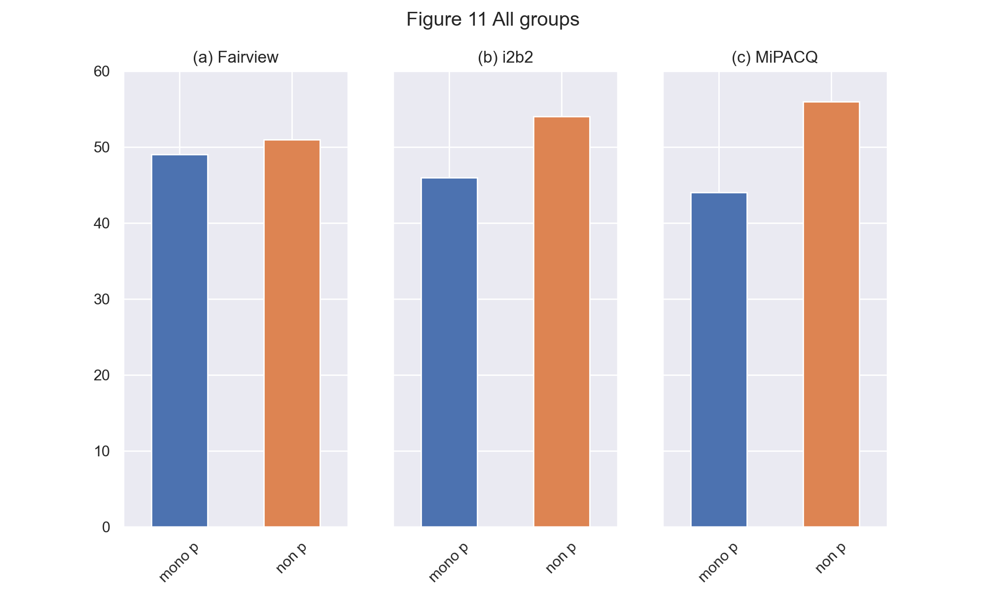
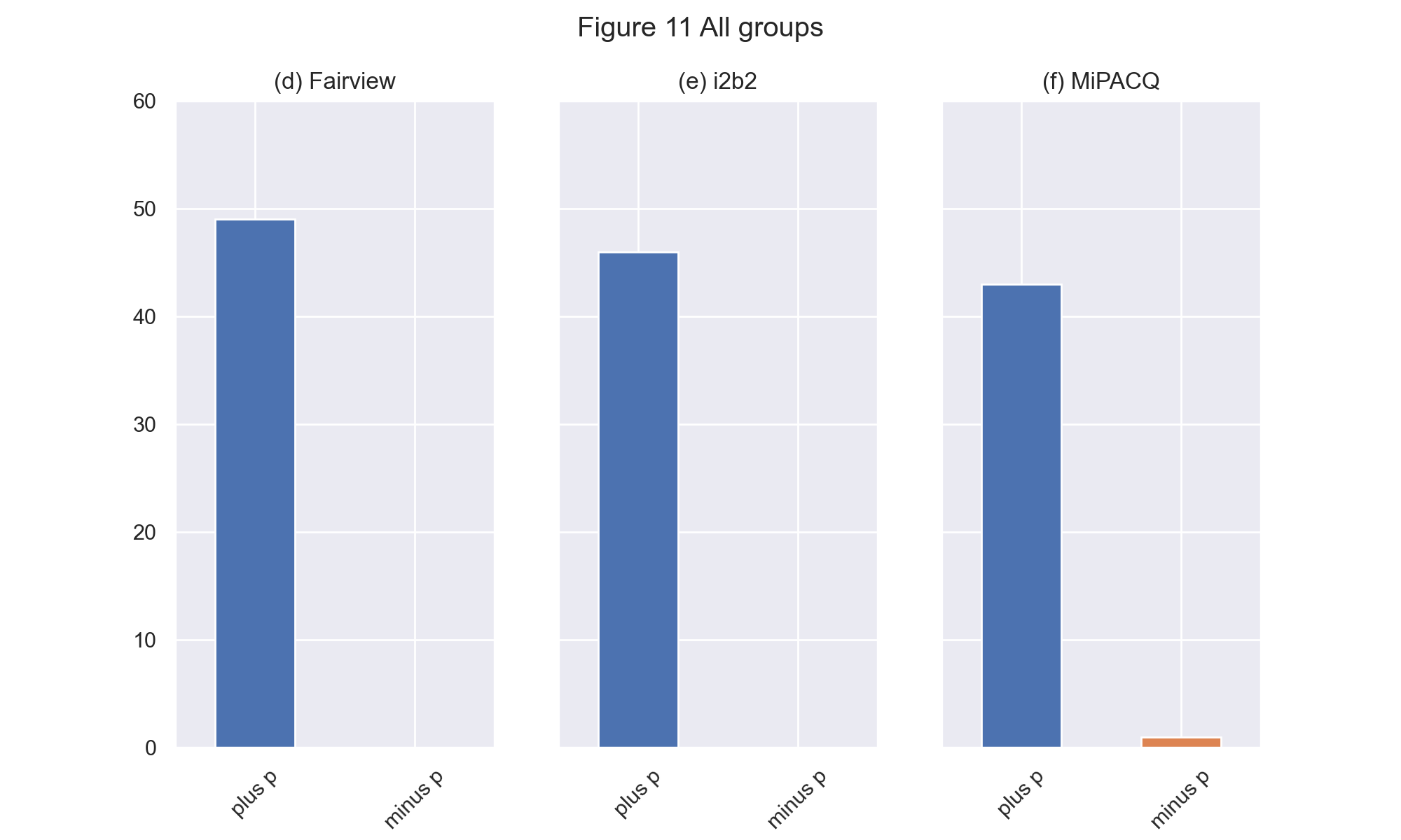
我使用以下代码将这两个数字作为单独的子图生成:
data = <above dataframe>
semgroups = ['all']
corpus = ['fairview', 'i2b2', 'mipacq']
for sg in semgroups:

    i = semgroups.index(sg)
    ix = i + 7

    ncols = len(set(data.corpus.tolist()))
    nrows = len(set(data.group.tolist()))

    fig = plt.figure()

    fig, axs = plt.subplots(1, ncols, sharey=True)

    for ax,(idx,row) in zip(axs.flat, data.iterrows()):
        # I WANT TO PLOT BOTH ROWS on same subplot
        #row[['mono p', 'non p']].plot.bar(ax=ax, color=['C0','C1'])
        row[['plus p', 'minus p']].plot.bar(ax=ax, color=['C0','C1'])
        if row['corpus'] == 'fairview':
            corpus = 'Fairview'
            label =  '(d) '
        elif row['corpus'] == 'mipacq':
            corpus = 'MiPACQ'
            if ncols == 3:
                label = '(f) '
            else:
                label = '(b) '
        else:
            corpus = 'i2b2'
            label = '(e) '

        ax.set_title(label + corpus)
        ax.tick_params(axis='x', labelrotation = 45)

    if sg == 'all':
        sg = 'All groups'

    # Defining custom 'xlim' and 'ylim' values.
    custom_ylim = (0, 60)

    # Setting the values for all axes.
    plt.setp(axs, ylim=custom_ylim)
    fig.suptitle('Figure ' + str(ix) + ' ' + sg)
在上面的代码中,我迭代我的df,获取以下行以生成两个单独的子图:
# BUT, I WANT TO PLOT BOTH ROWS ON SAME SUBPLOT
row[['mono p', 'non p']].plot.bar(ax=ax, color=['C0','C1'])
row[['plus p', 'minus p']].plot.bar(ax=ax, color=['C0','C1'])
无论我如何做到这一点,我都无法在一个子图中得到所需的两行(我总是得到一个空行,第二行没有数据)。
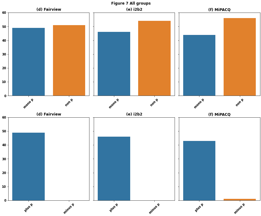
回答 1
Stack Overflow用户
回答已采纳
发布于 2021-10-19 12:57:45
见内联comments
- Tested in
python 3.8.12**,**pandas 1.3.3**,**matplotlib 3.4.3**,**seaborn 0.11.2
import pandas as pd
import matplotlib.pyplot as plt
import seaborn as sns  # seaborn is a high-level api for matplotlib

# sample dataframe
data = {'corpus': ['fairview', 'i2b2', 'mipacq'], 'group': ['all', 'all', 'all'], 'mono p': [49, 46, 44], 'non p': [51, 54, 56], 'plus p': [49, 46, 43], 'minus p': [0, 0, 1]}
df = pd.DataFrame(data)

semgroups = df.group.unique()  # unique groups
corpus = df.corpus.unique()  # unique corpus
rows = [['mono p', 'non p'], ['plus p', 'minus p']]  # columns for each row of plots
for sg in semgroups:

    i = semgroups.index(sg)
    ix = i + 7

    ncols = len(corpus)  # 3 columns for the example
    nrows = len(rows)  # 2 rows for the example

    # create a figure with 2 rows of 3 columns: axes is a 2x3 array of <AxesSubplot:>
    fig, axes = plt.subplots(nrows, ncols, sharey=True, figsize=(12, 10))

    # iterate through each plot row combined with a list from rows
    for axe, row in zip(axes, rows):
        # iterate through each plot column of the current row
        for i, ax in enumerate(axe):

            # select the data for each plot
            data = df.loc[df.group.eq(sg) & df.corpus.eq(corpus[i]), row]

            # plot the dataframe, but setting the bar color is more difficult
#             data.T.plot(kind='bar', legend=False, ax=ax)

            # plot the data with seaborn, which is easier to color the bars
            sns.barplot(data=data, ax=ax)

            if corpus[i] == 'fairview':
                l2 = 'Fairview'
                l1 =  '(d) '
            elif corpus[i] == 'mipacq':
                l2 = 'MiPACQ'
                if ncols == 3:
                    l1 = '(f) '
                else:
                    l1 = '(b) '
            else:
                l2 = 'i2b2'
                l1 = '(e) '

            ax.set_title(l1 + l2)
            ax.tick_params(axis='x', labelrotation = 45)

    if sg == 'all':
        sg = 'All groups'

    # Defining custom 'xlim' and 'ylim' values.
    custom_ylim = (0, 60)

    # Setting the values for all axes.
    plt.setp(axes, ylim=custom_ylim)
    fig.suptitle('Figure ' + str(ix) + ' ' + sg)
    fig.tight_layout()
    plt.show()
页面原文内容由Stack Overflow提供。腾讯云小微IT领域专用引擎提供翻译支持
原文链接:
https://stackoverflow.com/questions/69623487
复制相关文章
相似问题
腾讯云开发者

Copyright © 2013 - 2026 Tencent Cloud. All Rights Reserved. 腾讯云 版权所有
深圳市腾讯计算机系统有限公司 ICP备案/许可证号:粤B2-20090059 ![]() 粤公网安备44030502008569号
粤公网安备44030502008569号
腾讯云计算(北京)有限责任公司 京ICP证150476号 | 京ICP备11018762号