
Charts.js颜色有问题
Charts.js颜色有问题
提问于 2022-06-28 22:48:23
一位朋友帮助我让Charts.js工作,我现在正试图从精神上改变他所做的工作,即显示数据,使数据以我想要的方式显示。通常有8-10条线要画,所以我试图通过引入颜色来使数据更容易阅读。
通过为borderColor设置值,我能够让每条线都有一个唯一的颜色,但是出现在这条线上的点与直线不匹配,而是在沿着这条线移动时发生变化。我希望这些点与这条线一致。我不知道我哪里出了问题。有人能帮我解决这些颜色问题吗?
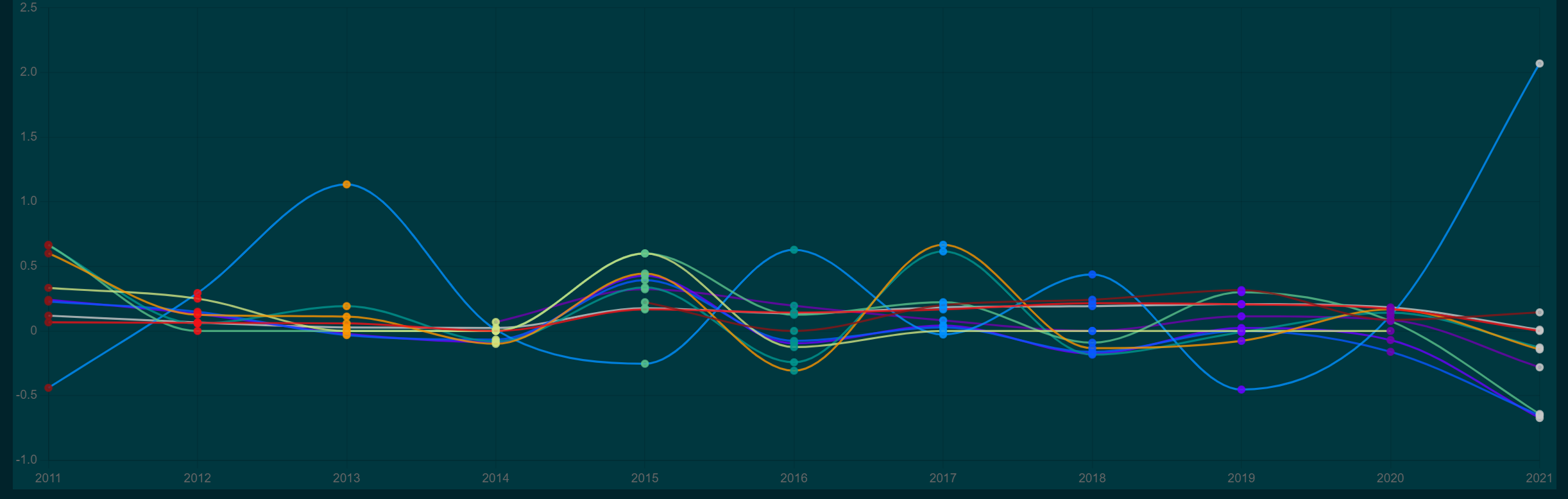
为了简单起见,我已经将下面的代码裁剪为3种颜色,但我在代码中列出了11种颜色。以下将循环3点的颜色沿着每条线。我想要的是线条颜色,背景颜色和点颜色来匹配。
<script setup lang="ts">
import { Line } from "vue-chartjs";
import {
  Chart as ChartJS,
  Title,
  Tooltip,
  Legend,
  LineElement,
  LinearScale,
  PointElement,
  CategoryScale,
} from "chart.js";
import type { DataYearlyGrowth} from "@/types/myData";
import { useDark } from "@vueuse/core";

ChartJS.register(
  Title,
  Tooltip,
  Legend,
  LineElement,
  LinearScale,
  PointElement,
  CategoryScale
);

const props = defineProps<{ data: Array<DataYearlyGrowth> }>();

const chartId = "line-chart";
const datasetIdKey = "label";
const width = 300;
const height = 100;
const styles = {};

const yearlyGrowthValues = props.data;
const years = [...new Set(yearlyGrowthValues.map((x) => x.year.toString()))];

const dataByTypes = yearlyGrowthValues.reduce((rv, x) => {
  (rv[x.type] = rv[x.type] || []).push(x.value);
  return rv;
}, {} as { [key: string]: Array<any> });

const chartData = {
  labels: years,
  datasets: Object.keys(dataByTypes).map((key) => ({
    text: 'Yearly growth',
    label: key,     // TODO: Make the font colour white
    data: dataByTypes[key],
    hoverBackgroundColor: 'rgba(211, 211, 211, 0.8)',
    borderColor:    // Line colour
      [
        'rgba(138, 20, 21, 0.8)',
        'rgba(241, 16, 22, 0.8)',
        'rgba(249, 148, 0, 0.8)'
      ],
    backgroundColor: // Middle of line colour. Just colours the square in the key
       [
         'rgba(138, 20, 21, 1)',
         'rgba(241, 16, 22, 1)',
         'rgba(249, 148, 0, 1)'
       ],
    pointBackgroundColor:   // Colours the middle of the points where data intersects years
      [
        'rgba(138, 20, 21, 0.8)',
        'rgba(241, 16, 22, 0.8)',
        'rgba(249, 148, 0, 0.8)'
      ],
    fill: true,
    borderWidth: 2,
    cubicInterpolationMode: 'monotone',
    //stepped:  'middle',
    stepped: false,
    borderJoinStyle: "round",
    tension: 0.2,
  }))
};

const chartOptions = {
responsive: true,
};

</script>

<template>
  <div class="bg-qual-mid">
    <Line
      :chart-options="chartOptions"
      :chart-data="chartData as any"
      :chart-id="chartId"
      :dataset-id-key="datasetIdKey"
      :plugins="[]"
      :styles="styles"
      :width="width"
      :height="height"
    />
  </div>
</template>
另外,我试着用白色显示标签--我试过了,但没什么区别
const chartOptions = {
 legend: {
   labels: {
    fontColor: 'white'
   }
 },
responsive: true,
};回答 1
Stack Overflow用户
回答已采纳
发布于 2022-06-29 07:14:18
这是因为您将color定义为数组,如果您想要静态颜色,则只需提供1种静态颜色,如下所示:
const colors = [
  'rgba(138, 20, 21, 0.8)',
  'rgba(241, 16, 22, 0.8)',
  'rgba(249, 148, 0, 0.8)'
];

const chartData = {
  labels: years,
  datasets: Object.keys(dataByTypes).map((key, i) => ({
    text: 'Yearly growth',
    label: key,     // TODO: Make the font colour white
    data: dataByTypes[key],
    hoverBackgroundColor: 'rgba(211, 211, 211, 0.8)',
    borderColor: colors[i % colors.length], // Get color for this index, roll over if index is larger then array size
    backgroundColor: colors[i % colors.length], // Get color for this index, roll over if index is larger then array size
    pointBackgroundColor: colors[i % colors.length], // Get color for this index, roll over if index is larger then array size
    fill: true,
    borderWidth: 2,
    cubicInterpolationMode: 'monotone',
    //stepped:  'middle',
    stepped: false,
    borderJoinStyle: "round",
    tension: 0.2,
  }))
};页面原文内容由Stack Overflow提供。腾讯云小微IT领域专用引擎提供翻译支持
原文链接:
https://stackoverflow.com/questions/72793955
复制相关文章
相似问题
腾讯云开发者

Copyright © 2013 - 2026 Tencent Cloud. All Rights Reserved. 腾讯云 版权所有
深圳市腾讯计算机系统有限公司 ICP备案/许可证号:粤B2-20090059 ![]() 粤公网安备44030502008569号
粤公网安备44030502008569号
腾讯云计算(北京)有限责任公司 京ICP证150476号 | 京ICP备11018762号