
R中具有多重比较的重排序条形图?
R中具有多重比较的重排序条形图?
提问于 2022-06-27 18:42:57
考虑下面的数据集:三个变量和一个分类性别变量一起使用
#Example Data
    Extraversion <- c(4.3, 2, 4.2, 4, 2, 1.5, 3.8, 3.5, 2.1, 2.1, 3)
    Anxiety <- c(1.2, 3, 1, 2.3, 5, 5, 2.3, 2.2, 5, 4.5, 3)
    Depression <- c(2, 3.5, 1, 3.5, 5, 5, 1, 2, 4.3, 4.5, 1)
    Sex <- c("Male", "Female", "Male", "Male", "Female", "Female", "Male",
             "Female", "Female", "Female", "Male")

    data <- data.frame(Extraversion, Anxiety, Depression, Sex)
现在,我意识到如何从这里的代码中生成一个类似的图形。
library(ggpubr)
library(ggplot2)
library(ggsci)

data %>% #specifies dataset
  pivot_longer(-Sex) %>%  #Pivotes graph longways
  ggbarplot(x = "Sex", #Splitting variable
            y = "value", #Just call this value, its the value on the x axis
            facet.by = "name", #selects variables for comapirson leave "name"
            add = c("mean_se", "jitter"),, #Creates error bars, Adds data points jittered
            width = .99, #Edits wdith of bars
            size = .2, #Border thickness
            error.plot = "errorbar",
            add.params = list(size = .1, alph = .3), #changes size of points and alpha level
            color = "black",
            fill = "Sex", #Fills colors by Sex variable
            alpha = .7, #Alpha for bar fill color
            palette = "jama", #ggsci palette
            position = position_dodge()) +
  theme_classic2() #theme
然而,我想知道是否有办法重新排序比较?例如,在抑郁和焦虑之前(图中从左到右)的外向性比较。目前,它默认为第一个面板中的焦虑。
我通常会在forcats包中做类似的事情,但是我只使用单个变量来完成。也许有什么办法来安排这些面板?
回答 1
Stack Overflow用户
回答已采纳
发布于 2022-06-27 18:47:47
您可以在factor中创建"name“列,在该列中,您可以按照以下代码在mutate中订购levels:
library(ggpubr)
library(ggplot2)
library(ggsci)
data %>% #specifies dataset
pivot_longer(-Sex) %>% #Pivotes graph longways
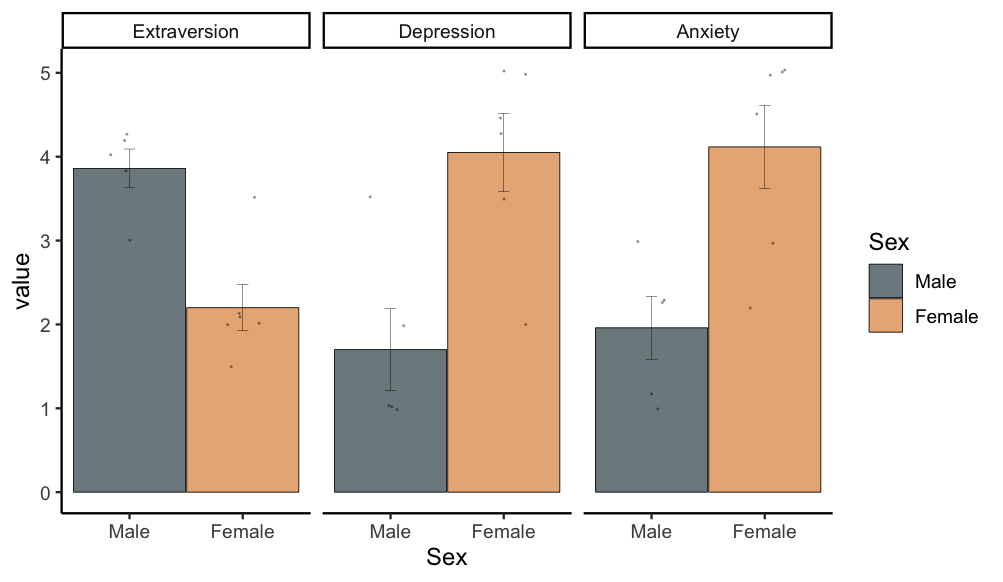
mutate(name = factor(name, levels = c("Extraversion", "Depression", "Anxiety"))) %>%
ggbarplot(x = "Sex", #Splitting variable
y = "value", #Just call this value, its the value on the x axis
facet.by = "name", #selects variables for comapirson leave "name"
add = c("mean_se", "jitter"),, #Creates error bars, Adds data points jittered
width = .99, #Edits wdith of bars
size = .2, #Border thickness
error.plot = "errorbar",
add.params = list(size = .1, alph = .3), #changes size of points and alpha level
color = "black",
fill = "Sex", #Fills colors by Sex variable
alpha = .7, #Alpha for bar fill color
palette = "jama", #ggsci palette
position = position_dodge()) +
theme_classic2() #theme输出:
页面原文内容由Stack Overflow提供。腾讯云小微IT领域专用引擎提供翻译支持
原文链接:
https://stackoverflow.com/questions/72776964
复制相关文章
相似问题
腾讯云开发者

Copyright © 2013 - 2026 Tencent Cloud. All Rights Reserved. 腾讯云 版权所有
深圳市腾讯计算机系统有限公司 ICP备案/许可证号:粤B2-20090059 ![]() 粤公网安备44030502008569号
粤公网安备44030502008569号
腾讯云计算(北京)有限责任公司 京ICP证150476号 | 京ICP备11018762号