【02】写一个注册页面以及配置打包选项打包安卓apk测试—开发完整的社交APP-前端客户端开发+数据联调|以优雅草商业项目为例做开发-flutter开发-全流程
原创
【02】写一个注册页面以及配置打包选项打包安卓apk测试—开发完整的社交APP-前端客户端开发+数据联调|以优雅草商业项目为例做开发-flutter开发-全流程
原创
卓伊凡
发布于 2025-01-16 13:37:19
发布于 2025-01-16 13:37:19
【02】写一个注册页面以及配置打包选项打包安卓apk测试—开发完整的社交APP-前端客户端开发+数据联调|以优雅草商业项目为例做开发-flutter开发-全流程-商业应用级实战开发-优雅草央千澈
章节内容【02】
写一个注册页面以及配置打包选项打包安卓apk测试
开发背景
上次我们安装了flutter 配置了vs-code的环境,这次我们来写一个注册页面,以及最基本的打包。
闲话不多,开源仓库地址,可以观摩已经写好的代码:
https://gitee.com/youyacao/ff-flutter
实战开始
首先我们新建一个flutter 项目,记得选择是空内容,那么默认flutter项目里面是hello word代码,main.dart便是我们的主页代码。
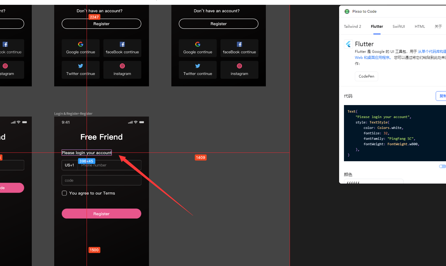
我们查看设计图,
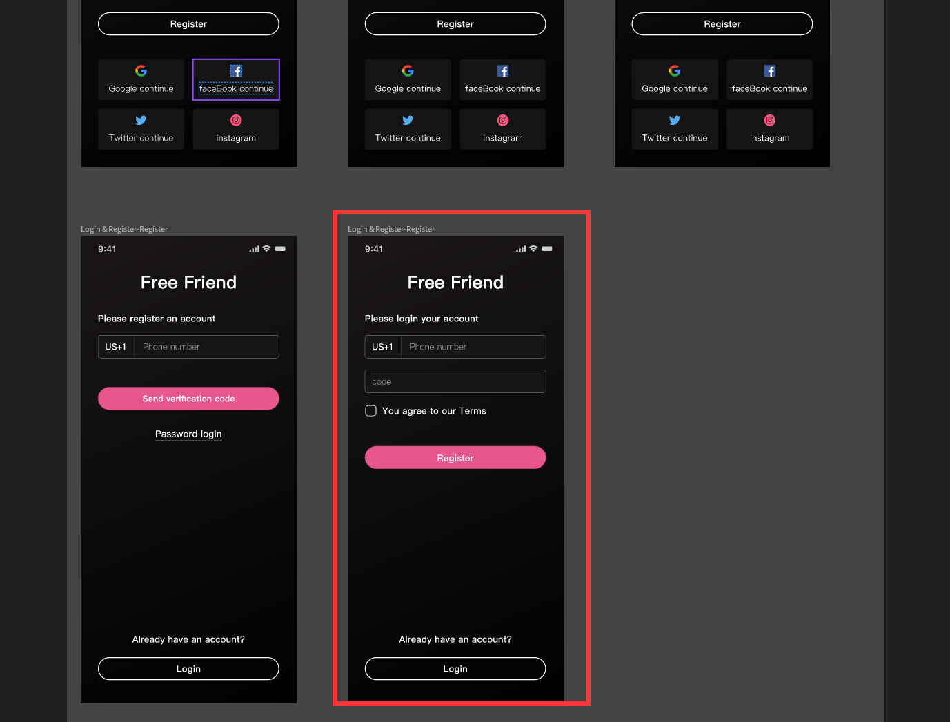
先看登录页面,有手机号填写表单,有密码表单,有注册按钮,登录按钮,以及忘记密码文字。
我们先把样式写出来,如下:
import 'package:flutter/material.dart';
void main() {
runApp(const MainApp());
}
class MainApp extends StatelessWidget {
const MainApp({super.key});
@override
Widget build(BuildContext context) {
return MaterialApp(
home: Scaffold(
appBar: AppBar(
title: const Text('Free Friend'),
),
body: Padding(
padding: const EdgeInsets.all(16.0),
child: Column(
mainAxisAlignment: MainAxisAlignment.center,
children: <Widget>[
TextField(
decoration: InputDecoration(
labelText: '请输入手机号',
border: OutlineInputBorder(),
),
keyboardType: TextInputType.phone,
),
const SizedBox(height: 16.0),
TextField(
decoration: InputDecoration(
labelText: '请输入密码',
border: OutlineInputBorder(),
),
obscureText: true,
),
const SizedBox(height: 24.0),
ElevatedButton(
onPressed: () {
// 注册按钮点击事件
print('注册按钮被点击');
},
style: ElevatedButton.styleFrom(
backgroundColor: Colors.red, // 设置红色背景
),
child: const Text('注册'),
),
const SizedBox(height: 8.0),
ElevatedButton(
onPressed: () {
// 登录按钮点击事件
print('登录按钮被点击');
},
style: ElevatedButton.styleFrom(
backgroundColor: Colors.red, // 设置红色背景
),
child: const Text('登录'),
),
],
),
),
),
);
}
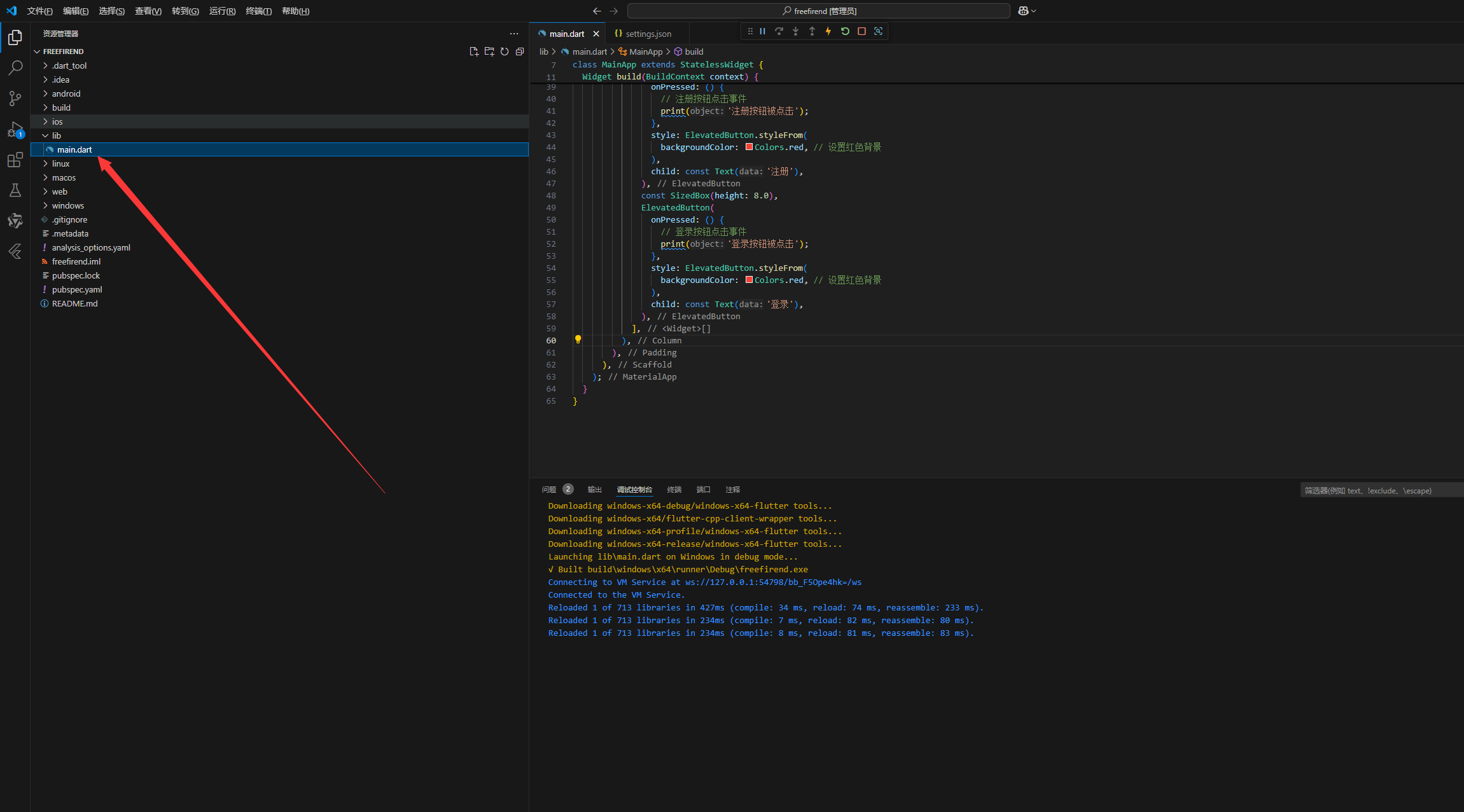
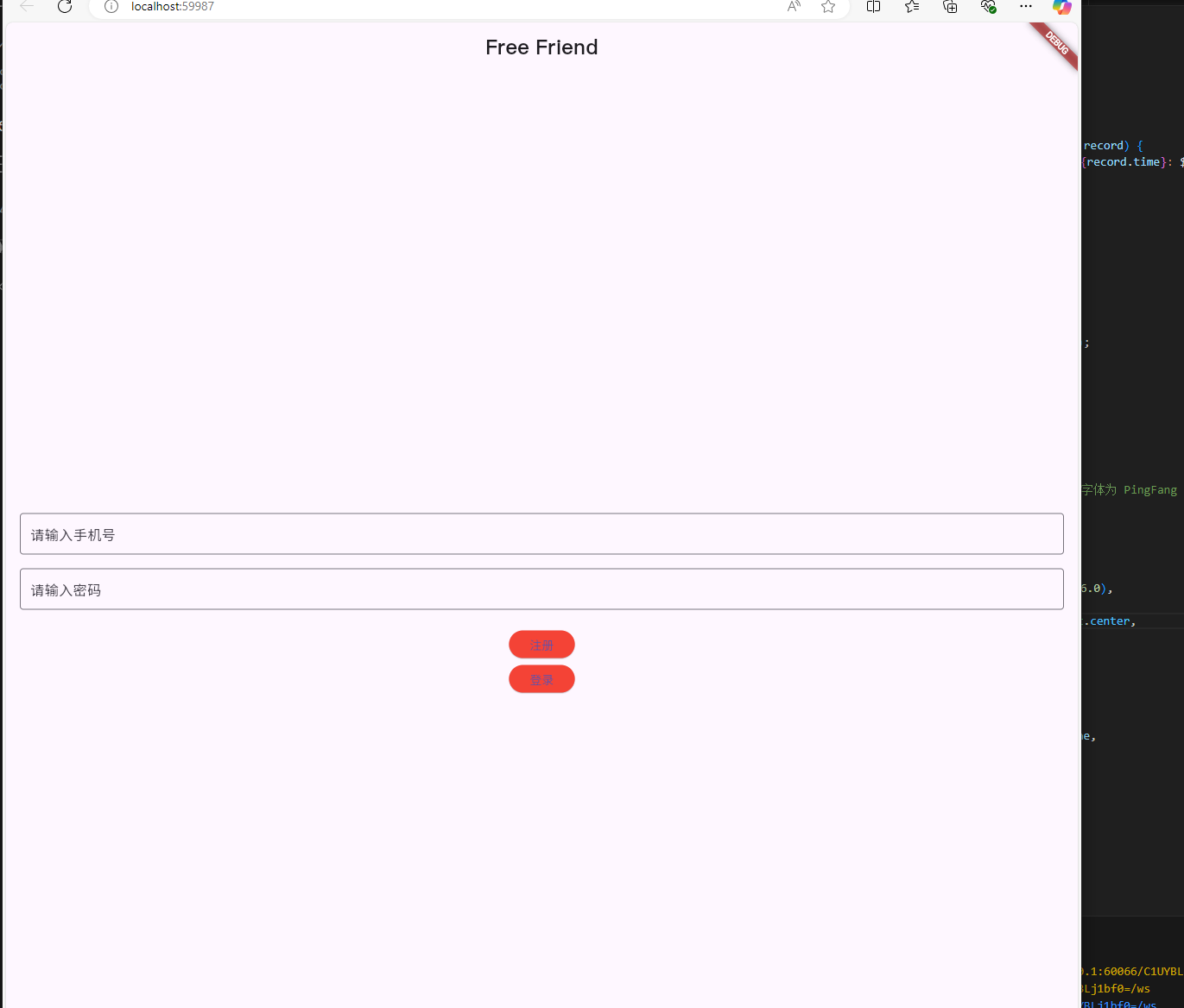
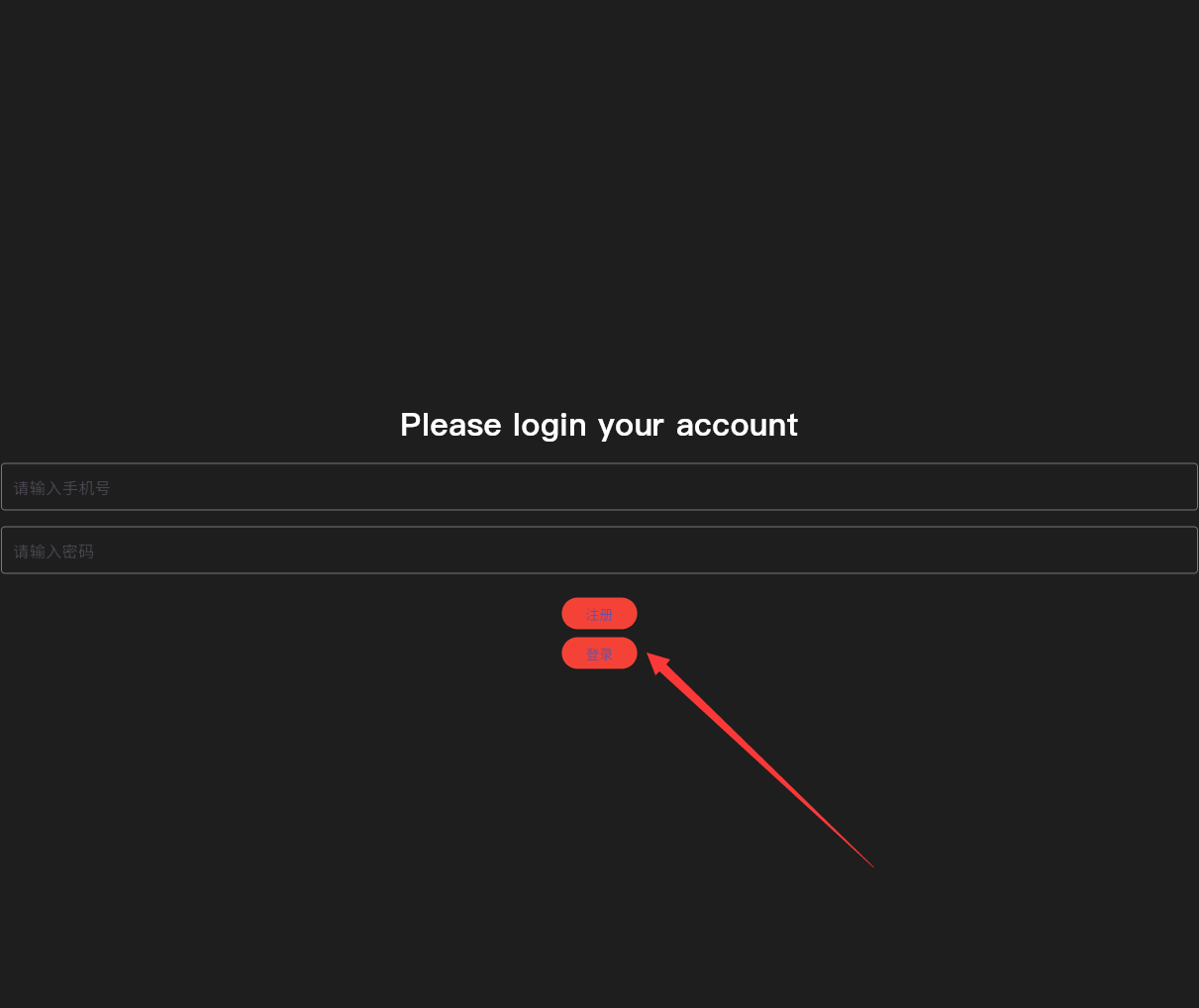
}运行查看,我们看到结果样子,
对比设计图有几个点要改,1,顶部文字应该大写并且居中,而且字体是PingFang SC 2,手机号表单上上面要加一行描述, 3,输入密码下方需要增加一个同意协议的选项框。
在pubspec.yaml 中加入 字体
fonts:
    - family: PingFang SC
      fonts:
        - asset: fonts/PingFangSC-Regular.ttf
修改源代码:
import 'package:flutter/material.dart';

void main() {
  runApp(const MainApp());
}

class MainApp extends StatelessWidget {
  const MainApp({super.key});

  @override
  Widget build(BuildContext context) {
    return MaterialApp(
      home: Scaffold(
        appBar: AppBar(
          title: const Text(
            'Free Friend',
            style: TextStyle(
              fontSize: 24.0, // 设置字体大小
              fontFamily: 'PingFang SC', // 设置字体为 PingFang SC
            ),
          ),
          centerTitle: true, // 居中标题
        ),
        body: Padding(
          padding: const EdgeInsets.all(16.0),
          child: Column(
            mainAxisAlignment: MainAxisAlignment.center,
            children: <Widget>[
              TextField(
                decoration: InputDecoration(
                  labelText: '请输入手机号',
                  border: OutlineInputBorder(),
                ),
                keyboardType: TextInputType.phone,
              ),
              const SizedBox(height: 16.0),
              TextField(
                decoration: InputDecoration(
                  labelText: '请输入密码',
                  border: OutlineInputBorder(),
                ),
                obscureText: true,
              ),
              const SizedBox(height: 24.0),
              ElevatedButton(
                onPressed: () {
                  // 注册按钮点击事件
                  print('注册按钮被点击');
                },
                style: ElevatedButton.styleFrom(
                  backgroundColor: Colors.red, // 设置红色背景
                ),
                child: const Text('注册'),
              ),
              const SizedBox(height: 8.0),
              ElevatedButton(
                onPressed: () {
                  // 登录按钮点击事件
                  print('登录按钮被点击');
                },
                style: ElevatedButton.styleFrom(
                  backgroundColor: Colors.red, // 设置红色背景
                ),
                child: const Text('登录'),
              ),
            ],
          ),
        ),
      ),
    );
  }
}
并且我们在根目录创建资源文件夹目录
assets:
    - assets/
    - assets/images/
    - assets/icons/
    - assets/fonts/
代码对应写,文件夹也对应创立。
对应下载字体放在目录下,
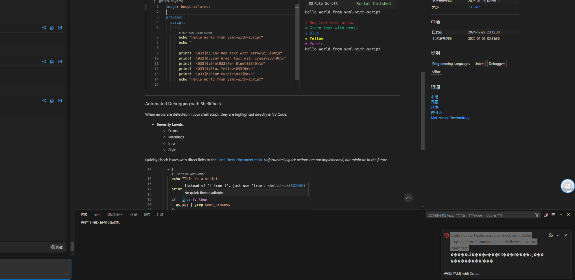
右下角报错 Could not start extension, shellsheck not installed properly!Error: Command failed: shellcheck —version ‘shellcheck’
这是 shellcheck没有正确安装,
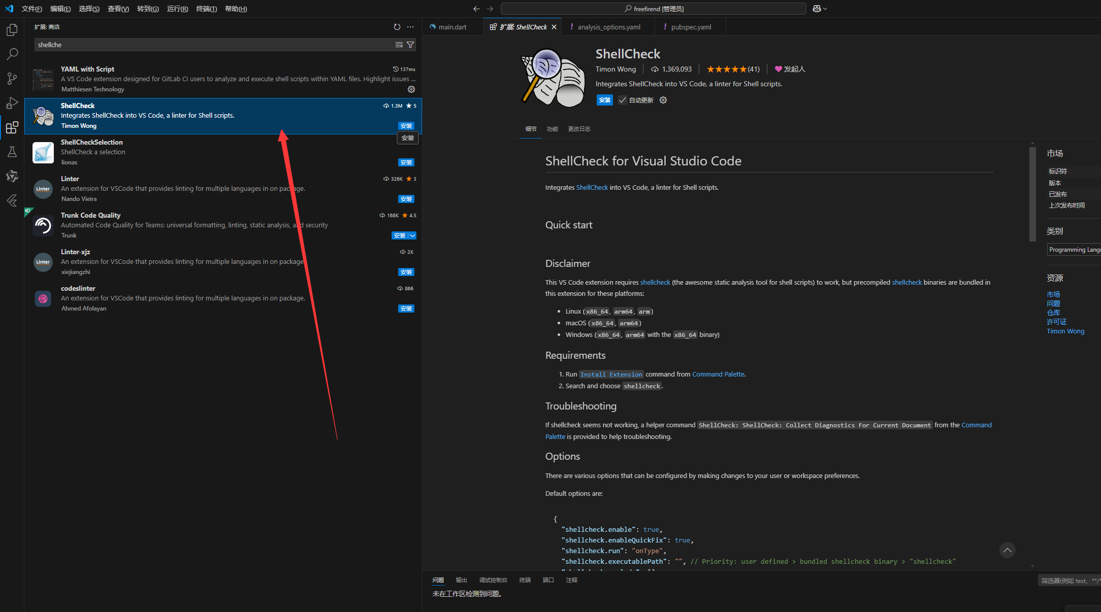
安装即可,再次运行
这时候我们开始做另外两个地方,
另外这里先扩展知识下:
一个标准的flutter项目目录
your_project/
├── android/               # Android 平台的相关文件
├── assets/                # 静态资源,如图片、音频等
├── build/                 # 编译生成的文件
├── ios/                   # iOS 平台的相关文件
├── lib/                   # Dart 源代码
│   ├── main.dart          # 应用程序的入口文件
│   └── ...                # 其他 Dart 文件和目录
├── test/                  # 单元测试文件
├── web/                   # Web 平台相关文件
├── windows/               # Windows 平台相关文件
├── macos/                 # MacOS 平台相关文件
├── linux/                 # Linux 平台相关文件
├── .gitignore             # Git 忽略文件配置
├── .metadata              # 项目信息文件
├── analysis_options.yaml  # 分析和代码检查规则
├── pubspec.yaml           # 项目配置文件,包含依赖项和其他配置信息
└── README.md              # 项目说明文件
其2,一个标准的社交软件的lib源代码dart文件目录大概是这样,
lib/
├── main.dart                # 应用程序入口文件
├── app/
│   ├── app.dart             # 应用程序的全局设置和配置
│   └── routes.dart          # 应用程序的路由配置
├── models/
│   ├── user.dart            # 用户数据模型
│   ├── post.dart            # 帖子数据模型
│   └── message.dart         # 消息数据模型
├── services/
│   ├── api_service.dart     # API 服务类
│   ├── auth_service.dart    # 身份验证服务
│   └── database_service.dart# 数据库服务
├── views/
│   ├── home/
│   │   ├── home_view.dart   # 主页视图
│   │   ├── home_viewmodel.dart # 主页视图模型
│   ├── profile/
│   │   ├── profile_view.dart # 个人资料视图
│   │   ├── profile_viewmodel.dart # 个人资料视图模型
│   ├── chat/
│   │   ├── chat_view.dart    # 聊天视图
│   │   ├── chat_viewmodel.dart # 聊天视图模型
│   ├── login/
│   │   ├── login_view.dart   # 登录视图
│   │   ├── login_viewmodel.dart # 登录视图模型
├── widgets/
│   ├── custom_button.dart    # 自定义按钮组件
│   ├── custom_textfield.dart # 自定义文本框组件
│   └── ...                   # 其他自定义组件
├── utils/
│   ├── constants.dart        # 常量定义
│   ├── utils.dart            # 工具函数
│   └── validators.dart       # 验证函数
└── resources/
    ├── colors.dart           # 颜色资源
    ├── strings.dart          # 字符串资源
    └── themes.dart           # 主题资源
目录结构说明
- main.dart:应用程序的入口文件。
- app/:存放全局设置和路由配置。
- models/:数据模型文件夹,定义用户、帖子、消息等数据结构。
- services/:服务文件夹,包括 API 服务、身份验证服务、数据库服务等。
- views/:视图文件夹,按照功能模块组织,例如主页、个人资料、聊天、登录等。
- widgets/:自定义组件文件夹,存放常用的自定义 UI 组件。
- utils/:工具文件夹,包含常量定义、工具函数和验证函数等。
- resources/:资源文件夹,包括颜色、字符串和主题资源等。
目前我们还没有开始分类这些目录,而是用的main.dart应用程序主入口来写,本篇只是给看测试,另附上蜻蜓z雪花版的文件目录参考:
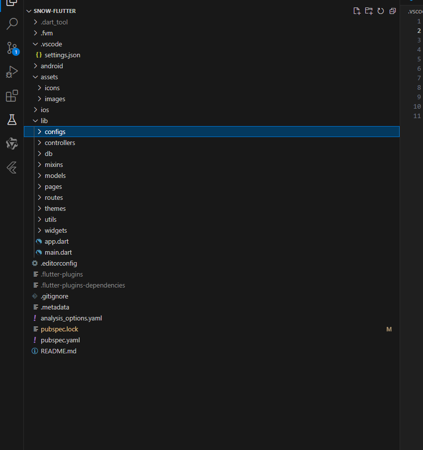
完整的项目目录是:
├─configs
├─controllers
│  ├─base
│  ├─movie
│  └─public
├─db
├─mixins
│  ├─movie
│  └─public
├─models
│  ├─base
│  ├─movie
│  ├─public
│  ├─review
│  └─user
├─pages
│  ├─advertising
│  │  └─advertising_home
│  │      ├─controllers
│  │      ├─models
│  │      └─widgets
│  ├─barrage
│  │  ├─send
│  │  │  ├─controllers
│  │  │  ├─models
│  │  │  └─widgets
│  │  └─site
│  │      └─widgets
│  ├─brush
│  │  ├─drama
│  │  │  ├─controllers
│  │  │  └─widgets
│  │  ├─enter
│  │  │  ├─controllers
│  │  │  └─widgets
│  │  ├─full
│  │  │  ├─controllers
│  │  │  ├─mixins
│  │  │  ├─models
│  │  │  └─widgets
│  │  ├─home
│  │  │  ├─controllers
│  │  │  ├─mixins
│  │  │  ├─models
│  │  │  └─widgets
│  │  ├─reply
│  │  │  ├─controllers
│  │  │  ├─models
│  │  │  └─widgets
│  │  ├─review
│  │  │  ├─controllers
│  │  │  └─widgets
│  │  └─synopsis
│  │      ├─controllers
│  │      └─widgets
│  ├─home
│  │  ├─feedback
│  │  │  ├─controllers
│  │  │  └─widgets
│  │  ├─home_page
│  │  │  ├─controllers
│  │  │  ├─models
│  │  │  └─widgets
│  │  ├─pop_up_ad
│  │  │  └─widgets
│  │  ├─prompt
│  │  │  └─widgets
│  │  └─sort_page
│  │      ├─controllers
│  │      ├─models
│  │      └─widgets
│  ├─mine
│  │  ├─clear_cache
│  │  │  └─widgets
│  │  ├─clear_record
│  │  │  ├─controllers
│  │  │  └─widgets
│  │  ├─gold_rule
│  │  │  └─widgets
│  │  ├─invite
│  │  │  ├─controllers
│  │  │  ├─models
│  │  │  └─widgets
│  │  ├─invite_history
│  │  │  ├─controllers
│  │  │  └─widgets
│  │  ├─mine_home
│  │  │  └─widgets
│  │  ├─mysubs
│  │  │  ├─controllers
│  │  │  ├─models
│  │  │  └─widgets
│  │  ├─my_download
│  │  │  ├─controllers
│  │  │  └─widgets
│  │  ├─my_favorite
│  │  │  ├─controllers
│  │  │  ├─models
│  │  │  └─widgets
│  │  ├─my_statistics
│  │  │  ├─controllers
│  │  │  ├─models
│  │  │  └─widgets
│  │  ├─user_info
│  │  │  ├─controllers
│  │  │  └─widgets
│  │  └─withdraw
│  │      ├─controllers
│  │      └─widgets
│  ├─movie
│  │  ├─actor
│  │  │  ├─controllers
│  │  │  ├─models
│  │  │  └─widgets
│  │  ├─cache_play
│  │  │  ├─controllers
│  │  │  └─widgets
│  │  ├─detail
│  │  │  ├─controllers
│  │  │  ├─mixins
│  │  │  ├─models
│  │  │  └─widgets
│  │  ├─download
│  │  │  ├─controllers
│  │  │  └─widgets
│  │  ├─drama
│  │  │  ├─controllers
│  │  │  └─widgets
│  │  ├─exception
│  │  │  ├─controllers
│  │  │  └─widgets
│  │  ├─full_drama
│  │  │  ├─controllers
│  │  │  └─widgets
│  │  ├─line
│  │  │  ├─controllers
│  │  │  └─widgets
│  │  ├─play
│  │  │  ├─controllers
│  │  │  └─widgets
│  │  │      └─player
│  │  ├─play_full
│  │  │  ├─controllers
│  │  │  ├─mixins
│  │  │  ├─models
│  │  │  └─widgets
│  │  ├─record
│  │  │  ├─controllers
│  │  │  ├─models
│  │  │  └─widgets
│  │  ├─score
│  │  │  ├─controllers
│  │  │  ├─models
│  │  │  └─widgets
│  │  ├─share
│  │  │  └─widgets
│  │  └─synopsis
│  │      ├─controllers
│  │      └─widgets
│  ├─public
│  │  ├─splash_screen
│  │  │  ├─controllers
│  │  │  ├─models
│  │  │  └─widgets
│  │  ├─tabbar
│  │  │  ├─controllers
│  │  │  └─widgets
│  │  └─upgrade
│  │      ├─controllers
│  │      └─widgets
│  ├─review
│  │  ├─enter
│  │  │  ├─controllers
│  │  │  └─widgets
│  │  ├─home
│  │  │  ├─controllers
│  │  │  └─widgets
│  │  ├─record
│  │  │  ├─controllers
│  │  │  ├─models
│  │  │  └─widgets
│  │  └─reply
│  │      ├─controllers
│  │      ├─models
│  │      └─widgets
│  ├─site
│  │  ├─password
│  │  │  ├─controllers
│  │  │  └─widgets
│  │  ├─phone
│  │  │  ├─controllers
│  │  │  └─widgets
│  │  ├─question
│  │  │  ├─controllers
│  │  │  └─widgets
│  │  └─site_home
│  │      ├─controllers
│  │      └─widgets
│  ├─sort
│  │  ├─search
│  │  │  ├─controllers
│  │  │  ├─models
│  │  │  └─widgets
│  │  ├─sort_home
│  │  │  ├─controllers
│  │  │  ├─models
│  │  │  └─widgets
│  │  └─suggested
│  │      ├─controllers
│  │      └─widgets
│  └─user
│      ├─choose
│      │  └─widgets
│      ├─login
│      │  ├─controllers
│      │  ├─models
│      │  └─widgets
│      ├─pact
│      │  ├─controllers
│      │  ├─models
│      │  └─widgets
│      ├─phone_recover
│      │  ├─controllers
│      │  └─widgets
│      ├─register
│      │  ├─controllers
│      │  ├─models
│      │  └─widgets
│      └─safety_recover
│          ├─controllers
│          └─widgets
├─routes
│  ├─middlewares
│  └─modules
├─themes
│  └─pkg
├─utils
└─widgets
    ├─base
    │  └─app_network_image
    ├─emoji_text_field
    │  └─widgets
    ├─public
    │  └─page_indicator
    │      └─widgets
    ├─skeleton
    ├─ui
    │  ├─ad
    │  ├─barrage
    │  ├─cover
    │  └─review
    └─video_player
        ├─types
        └─widgets
            └─panel
这是优雅草蜻蜓z雪花版项目的客户端目录,为什么要先发出来呢,因为我们本次开发社交软件也是要对接好蜻蜓z系统的后端的,在第一篇中已经发过接口文档地址了,大家可以去参考看看。
接着我们把剩下两个问题改了好开始下一篇大整理了,
在输入手机号表单前面加上这个提示字样,字体也是pingfang SC,在请输入手机号表单上面增加描述文字“Please login your account”,文字描述FontWeight.w800,文字颜色为白色,这里我们需要用在 Column 中添加一个新的 Text 小部件,设置 Text 小部件的样式。
const Text(
  "Please login your account",
  style: TextStyle(
    color: Colors.white,
    fontSize: 32,
    fontFamily: "PingFang SC",
    fontWeight: FontWeight.w800,
  ),
),
大概是这样,我们加入在前面,
优雅草央千澈发现文字是加上了我们是不是还缺个背景色,我们只需要在 设置 Scaffold 的 backgroundColor 加入
backgroundColor: const Color(0xFF1E1E1E), // 设置背景色为 #1E1E1E
Scaffold扩展知识
在 Flutter 中,Scaffold 是一个非常重要的容器组件,它为应用程序提供了一个基本的结构和布局。这相当于一个框架,方便你在应用中创建常见的 UI 元素和布局,如应用栏、抽屉、底部导航栏等。
Scaffold 组件的关键属性
- appBar: 一个位于顶部的应用栏(
AppBar),通常包含标题、导航按钮和其他操作项。 - body: 主体内容区域,用于放置应用的主要内容。
- drawer: 一个抽屉(
Drawer),从屏幕边缘滑出,用于显示导航链接或选项。 - bottomNavigationBar: 一个位于底部的导航栏,用于在不同的页面之间切换。
- floatingActionButton: 一个悬浮按钮,通常用于触发主要操作。
- backgroundColor: 背景颜色。
这里注意在手机号前面还有国家地区选择,可以使用 DropdownButton 或 DropdownButtonFormField 来实现。这里我将使用 DropdownButtonFormField 来创建一个可选择国家地区号的下拉菜单。
// 示例国家地区号列表
    final List<String> countryCodes = ['+1', '+86', '+91', '+44', '+33'];


    // 默认选择的国家地区号
    String selectedCountryCode = countryCodes[0];


 Row(
                children: [
                  DropdownButtonFormField<String>(
                    value: selectedCountryCode,
                    onChanged: (String? newValue) {
                      if (newValue != null) {
                        selectedCountryCode = newValue;
                      }
                    },
                    items: countryCodes.map<DropdownMenuItem<String>>((String value) {
                      return DropdownMenuItem<String>(
                        value: value,
                        child: Text(value),
                      );
                    }).toList(),
                    decoration: const InputDecoration(
                      labelText: '选择国家地区号',
                      border: OutlineInputBorder(),
                    ),
                  ),
                  const SizedBox(width: 8.0),
                  Expanded(
                    child: TextField(
                      decoration: const InputDecoration(
                        labelText: '请输入手机号',
                        border: OutlineInputBorder(),
                      ),
                      keyboardType: TextInputType.phone,
                    ),
                  ),
                ],
              ),
扩展知识
DropdownButton 和 DropdownButtonFormField 是两个常用的组件,用于创建下拉菜单和表单中的下拉选择项。它们的区别在于 DropdownButtonFormField 更加适合用于表单验证和处理。
区别与使用场景
DropdownButton:适用于独立使用的下拉菜单,不需要表单验证。
DropdownButtonFormField:适用于表单中的下拉菜单,需要表单验证和处理。
不过我们出现了“Use ‘const’ with the constructor to improve performance. Try adding the ‘const’ keyword to the constructor invocation.” 这样的提示。
扩展知识
在 Flutter 和 Dart 中,const 和非 const(或 final 和普通变量)有着重要的区别,它们主要用于优化性能和管理不可变数据。
const:在编译时初始化,完全不可变,用于优化性能。
final:在运行时初始化,只能被赋值一次,用于定义在运行时确定但不可改变的值。
普通变量:可以在任何时候修改,适用于需要频繁更改的数据。
ok根据提示,我们需要完整的修改一下代码,
import 'package:flutter/material.dart';
import 'package:logging/logging.dart';

void main() {
  // 初始化日志记录器
  Logger.root.level = Level.ALL;
  Logger.root.onRecord.listen((record) {
    debugPrint('${record.level.name}: ${record.time}: ${record.message}');
  });

  runApp(const MainApp());
}

class MainApp extends StatelessWidget {
  const MainApp({super.key});

  @override
  Widget build(BuildContext context) {
    final logger = Logger('MainApp');
    logger.info('Building MainApp');

    // 示例国家地区号列表
    final List<String> countryCodes = ['+1', '+86', '+91', '+44', '+33'];

    // 默认选择的国家地区号
    String selectedCountryCode = countryCodes[0];

    return MaterialApp(
      home: Scaffold(
        backgroundColor: const Color(0xFF1E1E1E), // 设置背景色为 #1E1E1E
        appBar: AppBar(
          title: const Text(
            'Free Friend',
            style: TextStyle(
              fontSize: 24.0, // 设置字体大小
              fontFamily: 'PingFang SC', // 设置字体为 PingFang SC
            ),
          ),
          centerTitle: true, // 居中标题
        ),
        body: Padding(
          padding: const EdgeInsets.all(16.0),
          child: Column(
            mainAxisAlignment: MainAxisAlignment.center,
            children: <Widget>[
              const Text(
                "Please login your account",
                style: TextStyle(
                  color: Colors.white,
                  fontSize: 32,
                  fontFamily: "PingFang SC",
                  fontWeight: FontWeight.w800,
                ),
              ),
              const SizedBox(height: 16.0),
              Row(
                mainAxisAlignment: MainAxisAlignment.spaceBetween,  // 使用 spaceBetween 对齐方式
                children: [
                  Flexible(
                    flex: 1,  // 给 DropdownButtonFormField 分配一部分空间
                    child: DropdownButtonFormField<String>(
                      value: selectedCountryCode,
                      onChanged: (String? newValue) {
                        if (newValue != null) {
                          selectedCountryCode = newValue;
                        }
                      },
                      items: countryCodes.map<DropdownMenuItem<String>>((String value) {
                        return DropdownMenuItem<String>(
                          value: value,
                          child: Text(value),
                        );
                      }).toList(),
                      decoration: const InputDecoration(
                        labelText: '选择国家地区号',
                        border: OutlineInputBorder(),
                      ),
                      style: const TextStyle(fontSize: 16),  // 设置字体大小
                    ),
                  ),
                  const SizedBox(width: 8.0),
                  Expanded(
                    flex: 2,  // 给 TextField 分配更多的空间
                    child: TextField(
                      decoration: const InputDecoration(
                        labelText: '请输入手机号',
                        border: OutlineInputBorder(),
                      ),
                      keyboardType: TextInputType.phone,
                    ),
                  ),
                ],
              ),
              const SizedBox(height: 16.0),
              TextField(
                decoration: const InputDecoration(
                  labelText: '请输入密码',
                  border: OutlineInputBorder(),
                ),
                obscureText: true,
              ),
              const SizedBox(height: 24.0),
              ElevatedButton(
                onPressed: () {
                  // 注册按钮点击事件
                  logger.info('注册按钮被点击');
                },
                style: ElevatedButton.styleFrom(
                  backgroundColor: Colors.red, // 设置红色背景
                ),
                child: const Text('注册'),
              ),
              const SizedBox(height: 8.0),
              ElevatedButton(
                onPressed: () {
                  // 登录按钮点击事件
                  logger.info('登录按钮被点击');
                },
                style: ElevatedButton.styleFrom(
                  backgroundColor: Colors.red, // 设置红色背景
                ),
                child: const Text('登录'),
              ),
            ],
          ),
        ),
      ),
    );
  }
}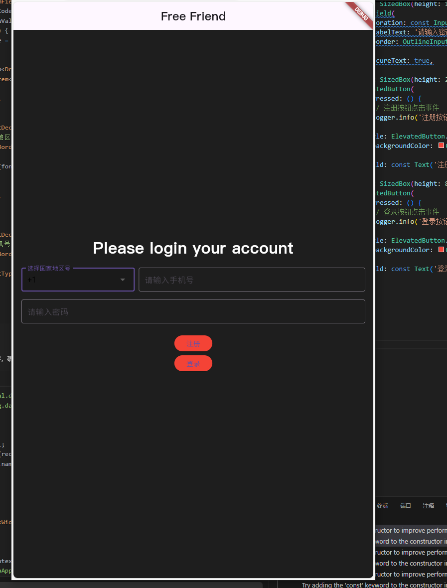
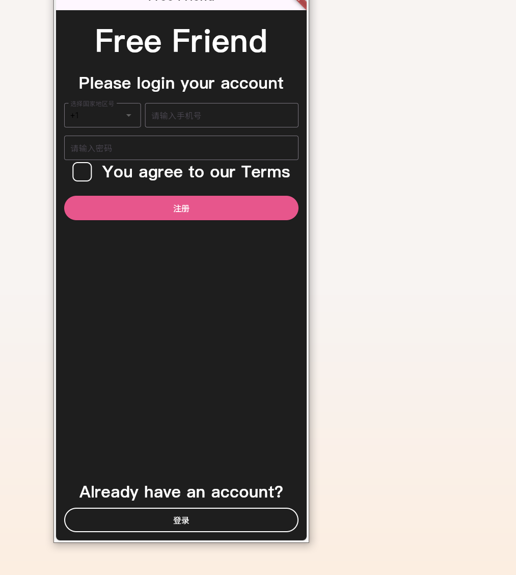
其次我们看到在提示登录上方还有 free firend大字 样, 因此我们写:
const Text(
                "Free Friend",
                style: TextStyle(
                  color: Colors.white,
                  fontSize: 61.87,
                  fontFamily: "PingFang SC",
                  fontWeight: FontWeight.w800,
                ),
              ),
              const SizedBox(height: 16.0),
在输入密码下方加入同意协议代码:
Row(
    mainAxisSize: MainAxisSize.min,
    mainAxisAlignment: MainAxisAlignment.start,
    crossAxisAlignment: CrossAxisAlignment.center,
    children:[
        Container(
            width: 38,
            height: 38,
            decoration: BoxDecoration(
                borderRadius: BorderRadius.circular(10),
                border: Border.all(color: Colors.white, width: 2, ),
            ),
        ),
        SizedBox(width: 20),
        Text(
            "You agree to our Terms",
            style: TextStyle(
                color: Colors.white,
                fontSize: 32,
                fontFamily: "PingFang SC",
                fontWeight: FontWeight.w500,
            ),
        ),
    ],
)
这里代码中
children:[
        Container(
            width: 38,
            height: 38,
            decoration: BoxDecoration(
                borderRadius: BorderRadius.circular(10),
                border: Border.all(color: Colors.white, width: 2, ),
            ),
        ),
肯定是不对的,这里只是用来做个样子,这里我们应该用选框组件,
在 Flutter 中实现同意协议的勾选框(CheckBox)通常可以使用 Checkbox 组件。为了更好地用户体验,您可以将 Checkbox 和 Text 组件组合在一起,创建一个带有同意协议的行(Row)。
再对注册按钮进行调整:
我们对按钮加宽度,加背景色,这里需要知道扩展知识, flutter 中对颜色表达 有4种方式,
- 使用颜色常量,2. 使用 ARGB 表示颜色,3. 使用十六进制表示颜色,4. 使用 Material 颜色
import 'package:flutter/material.dart';

void main() => runApp(MyApp());

class MyApp extends StatelessWidget {
  @override
  Widget build(BuildContext context) {
    return MaterialApp(
      home: Scaffold(
        appBar: AppBar(
          title: Text('Flutter 颜色示例'),
        ),
        body: Column(
          mainAxisAlignment: MainAxisAlignment.center,
          children: <Widget>[
            Container(
              height: 50,
              width: 50,
              color: Colors.red,
              child: Text('红色'),
            ),
            Container(
              height: 50,
              width: 50,
              color: Color.fromARGB(255, 0, 255, 0),
              child: Text('绿色'),
            ),
            Container(
              height: 50,
              width: 50,
              color: Color(0xFF0000FF),
              child: Text('蓝色'),
            ),
            Container(
              height: 50,
              width: 50,
              color: Colors.amber[600],
              child: Text('琥珀色'),
            ),
          ],
        ),
      ),
    );
  }
}
因此注册按钮的背景为
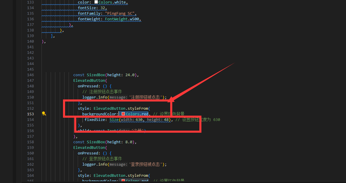
backgroundColor:Color(0xffe7568c), // 设置红色背景
对登录按钮进行调整,增加一个expanded组件,
Expanded 组件是 Flutter 中的一个布局组件,通常用于在行(Row)、列(Column)或弹性(Flex)布局中占据可用的剩余空间。这使得它在创建响应式布局时非常有用。
Expanded 组件的用途
填充剩余空间:在行或列布局中占据剩余的可用空间。
灵活调整:与其他布局组件(如 Flexible)结合使用,可以实现灵活的布局分配。
大家有没有发现 这个组件和margin是差不多的,所以编程一定是一门通门门通。
Expanded( // 添加 Expanded 组件
                child: Align(
                  alignment: Alignment.bottomCenter,
                  child: ElevatedButton(
                    onPressed: () {
                      // 登录按钮点击事件
                      logger.info('登录按钮被点击');
                    },
                    style: ElevatedButton.styleFrom(
                      backgroundColor: Color(0xffe7568c), // 设置红色背景
                      fixedSize: Size(630, 48), // 设置按钮宽度为 630
                    ),
                    child: const Text('登录'),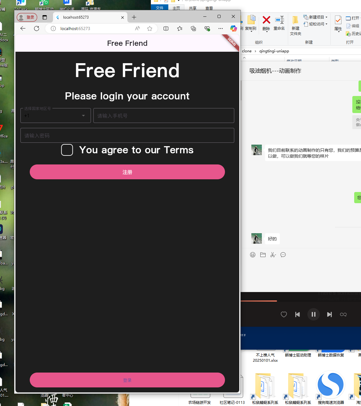
现在还差把登录页面背景框改掉,
为了在登录按钮上方加入文字 “Already have an account?” 并保持布局在页面底部,可以在 Expanded 组件中添加一个 Column 来包含这两个组件。以下是修改后的代码:
Expanded(
                child: Align(
                  alignment: Alignment.bottomCenter,
                  child: Column(
                    mainAxisSize: MainAxisSize.min,
                    children: [
                      Text(
                        "Already have an account?",
                        style: TextStyle(
                          color: Colors.white,
                          fontSize: 32,
                          fontFamily: "PingFang SC",
                          fontWeight: FontWeight.w800,
                        ),
                      ),
                      const SizedBox(height: 8.0),
                      ElevatedButton(
                        onPressed: () {
                          // 登录按钮点击事件
                          logger.info('登录按钮被点击');
                        },
                        style: ElevatedButton.styleFrom(
                          backgroundColor: Color(0xffe7568c), // 设置红色背景
                          fixedSize: Size(630, 48), // 设置按钮宽度为 630
                        ),
                        child: const Text('登录'),
                      ),
                    ],
                  ),
                ),
              ),
            ],
          ),
        ),
      ),
    );
  }
}
最后我们需要将登录框的,背景改为透明色,边框颜色改为白色
style: ElevatedButton.styleFrom(
                          backgroundColor: Color(0xffe7568c), // 设置红色背景
                          fixedSize: Size(630, 48), // 设置按钮宽度为 630
                        ),
也就是这部分代码,这时候涉及两个知识点,我们需要把OutlinedButton 代替 ElevatedButton
OutlinedButton(
                        onPressed: () {
                          // 登录按钮点击事件
                          logger.info('登录按钮被点击');
                        },
                        style: OutlinedButton.styleFrom(
                          side: BorderSide(color: Colors.white, width: 2), // 设置边框颜色为白色
                          fixedSize: Size(630, 48), // 设置按钮宽度为 630
                          backgroundColor: Colors.transparent, // 去掉背景色
                        ),
                        child: Text(
                          '登录',
                          style: TextStyle(
                            color: Colors.white, // 设置文字颜色为白色
                            fontSize: 16.0, // 可以根据需要调整字体大小
扩展知识
在Flutter中,OutlinedButton和ElevatedButton是两种不同风格的按钮组件,它们之间的主要区别体现在视觉表现和设计风格上。以下是对两者的详细比较:
OutlinedButton
- 视觉特点:
- 具有边框(outline),通常为黑色或灰色。
- 背景是透明的,不会覆盖其下的内容。
- 按下时只有边框颜色会发生变化,背景保持不变。
- 适用场景:
- 当需要突出按钮的轮廓而不是整体填充时使用。
- 适合搭配浅色背景或者当希望按钮看起来更轻盈时。
- 样式定制:
- 可以通过
style属性来自定义边框宽度、颜色等样式。
扩展知识Flutter中常见的Flutter按钮组件:
1. **ElevatedButton**
- 特点:具有阴影效果,看起来像是浮起的。
- 适用场景:适用于大多数需要突出显示的按钮。
2. **OutlinedButton**
- 特点:有边框但没有填充色,看起来更简洁。
- 适用场景:适合用于需要强调边界或与背景对比明显的场合。
3. **TextButton**
- 特点:仅有文本,无任何背景或边框。
- 适用场景:适用于文字为主且不需要额外视觉强调的按钮。
4. **IconButton**
- 特点:专门用于显示图标,可以设置图标大小和颜色。
- 适用场景:适合在界面中需要快速执行操作的图标按钮。
5. **MaterialButton**
- 特点:类似于ElevatedButton,但提供了更多的样式选项。
- 适用场景:适用于需要更多自定义样式的场景。
6. **RawMaterialButton**
- 特点:提供了最基础的按钮实现,允许最大程度的自定义。
- 适用场景:适用于需要高度定制按钮外观的情况。
7. **FloatingActionButton**
- 特点:圆形按钮,通常带有图标,悬浮在屏幕边缘。
- 适用场景:常用于导航或主要操作的快速执行。
8. **CupertinoButton**
- 特点:符合iOS设计风格的按钮。
- 适用场景:适用于需要在Flutter应用中融入iOS风格元素的情况。
9. **ToggleButton**
- 特点:可以切换状态的按钮,通常用于开关功能。
- 适用场景:适用于需要表示开/关状态的场景。
10. **CheckboxButton**
- 特点:结合了复选框功能的按钮。
- 适用场景:适用于需要用户选择多个选项的场景。
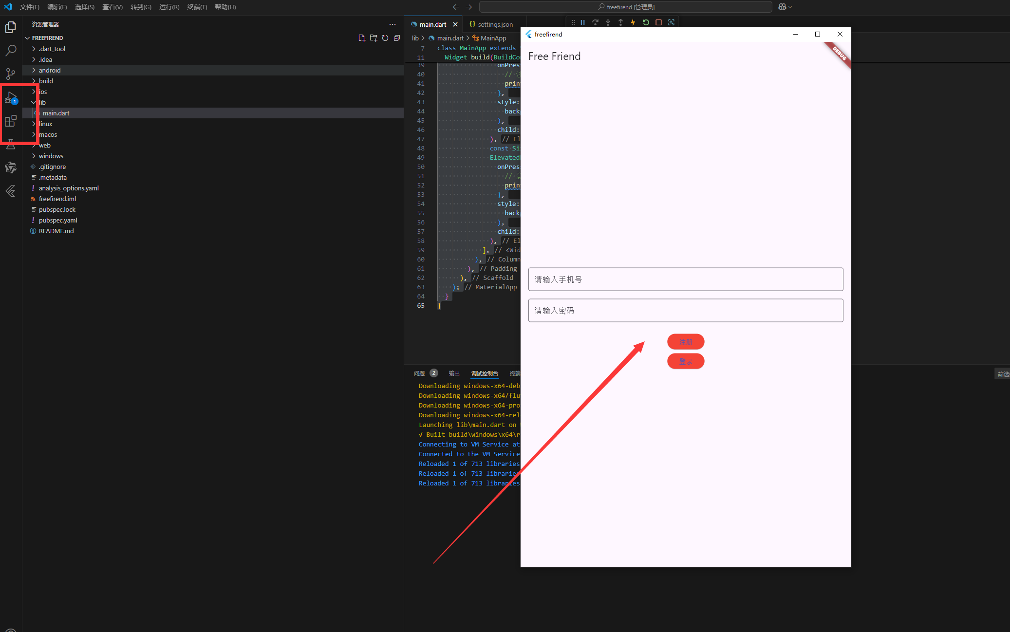
本页做为测试的首页基本就算完成了,接下来我们打包安卓APK,本文篇幅太多了-apk打包完整流程我们就留在第三篇幅吧
优雅草央千澈-只发干货!欢迎点赞关注+收藏!
原创声明:本文系作者授权腾讯云开发者社区发表,未经许可,不得转载。
如有侵权,请联系 cloudcommunity@tencent.com 删除。
原创声明:本文系作者授权腾讯云开发者社区发表,未经许可,不得转载。
如有侵权,请联系 cloudcommunity@tencent.com 删除。
评论
登录后参与评论
推荐阅读
目录
腾讯云开发者

Copyright © 2013 - 2026 Tencent Cloud. All Rights Reserved. 腾讯云 版权所有
深圳市腾讯计算机系统有限公司 ICP备案/许可证号:粤B2-20090059  粤公网安备44030502008569号
腾讯云计算(北京)有限责任公司 京ICP证150476号 | 京ICP备11018762号